‘ATCG’ is a four part piece of writing about the work of abstract painter Steve Joy. Linda Bell was invited to share her thoughts on Steve’s work as part of the ‘Seasons’ exhibition at Maple Street Construct in Omaha, Nebraska USA.
The four sections of ‘ATCG’ represent the four Seasons, the four points of the compass and the four base pairs of DNA.
The exhibition at Maple Street Construct will continue until 1st December 2024.
- A -
A r t i s t r y
The life of an artist can often be a convoluted one. We need only to look upon Zola’s novel ‘L’Oeuvre’ (The Masterpiece) to appreciate the sacrifice and devotion required to satisfy the muse. That, and to scale the lofty heights of the seemingly ungraspable realisation of artistic vision.
From serving in Britain’s Royal Air Force, flying from far-flung locations, such as Addu Atoll in the Maldives, Singapore and Cyprus, to competing at the Common Wealth Games as a track cyclist, the life lived by that of abstract painter Steve Joy has involved many chapters.
Steve Joy with Sidecar, Menorca, 1989
Whilst on leave in Amsterdam, Steve experienced an exhibition of Barnett Newman’s striped paintings. This in part inspired Steve to become an artist and to follow in the footsteps of those such as Agnes Martin, with her delicate colour palette, sense of divine simplicity and steadfast approach to artistry.
Despite the risks associated with being an artist: financial insecurity, intermittent recognition within the artworld itself, the notion of existing at the very edge of society and orbiting its endless margins, Steve embarked on seven years of intense study. From the UK’s Cardiff, Exeter and Chelsea Schools of Art to receiving a Cheltenham Scholarship, Steve was awarded a Monbusho Fellowship and exchanged stable representation with the Lisson Gallery for an opportunity to study in Kyoto, Japan.
Sunstone III, 1980, Acrylic and Oil on Canvas, 22 x 12.5 Inches, 56 x 31.5 cm
Early exhibitions saw Steve display his Sunstone paintings alongside work by Andy Goldsworthy at the Serpentine Gallery in London. However, the fashion for minimal painting encouraged Steve to forge an alternative path. A path leading to deep investigation of visual culture from the past to imbue his work with layers of contemporary and historical references.
A sort of Grand Tour entailed. Steve lived in Italy; Bruges, Barcelona as well as Scandinavia where he taught as a professor and department head in both Trondheim and Bergen Academies of Arts, and then as a Professor at the Ecole des Beaux Arts in Caen, France.
Each location offered Steve the opportunity to experience the great art and architecture of the Byzantine Age and Medieval Realms – windows into a pre-renaissance world – in person. Regular exhibitions at Galerie Storrer in Zurich along with Museum shows in Norway ensured Steve continued to develop his work within the shifting frameworks of contemporary cultural perspectives throughout these many relocations.
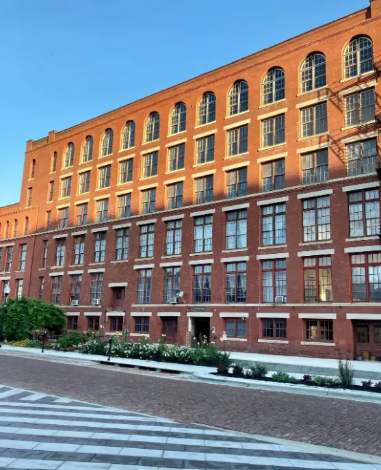
Steve's Studio in the Old Market of Omaha
Arriving in the United States to be a Guest Curator at the Bemis provided Steve with the support and patronage to further his practice, with time also spent in New York through association with Ruth Siegal Gallery.
For the last 20 years or so, Steve has been based in Omaha, his Icon-inspired paintings well known throughout the mid-west and beyond, featuring in Collections such as the NYC Public Library, the Phillip Shrager Collection, the United States National Collection in Washington D.C., the Joslyn Museum,the Orpheum Opera House and HDR.
A Song For Athene (For John Taverner), 2019, Mixed Media on Wood Panels
With the major retrospective exhibition ‘Uncreated Light’ hosted at the Joslyn Museum in 2008 and a 10 year survey organised at Sioux City Art Centre in 2018, Steve has also exhibited at the Willa Catha Foundation and the Art Bank in McCook. ‘Seasons’ is his second show here at Maple Street Construct.
Creativity is innovation and Steve has always been pushing the boundaries of what a painting is and should be. And to that end what it means to be an artist during the Anthropocene and the age of A.I. Steve’s abstract works trace their origins back towards the crux of ancient civilisations, exploring the value of our human history and fulfilling the artist’s responsibility: to invite us to look afresh and discover a deeper meaning to the stories of the past.
- t -
T I M E
An insect crawls across the expanse of a shiny green leaf.
Someone leaps into the inky waters of a lake.
Sheaves of golden grains whisper, dancing in the breeze.
A grey pebble swoops down the side of a cliff to rest upon a ledge for a million years.
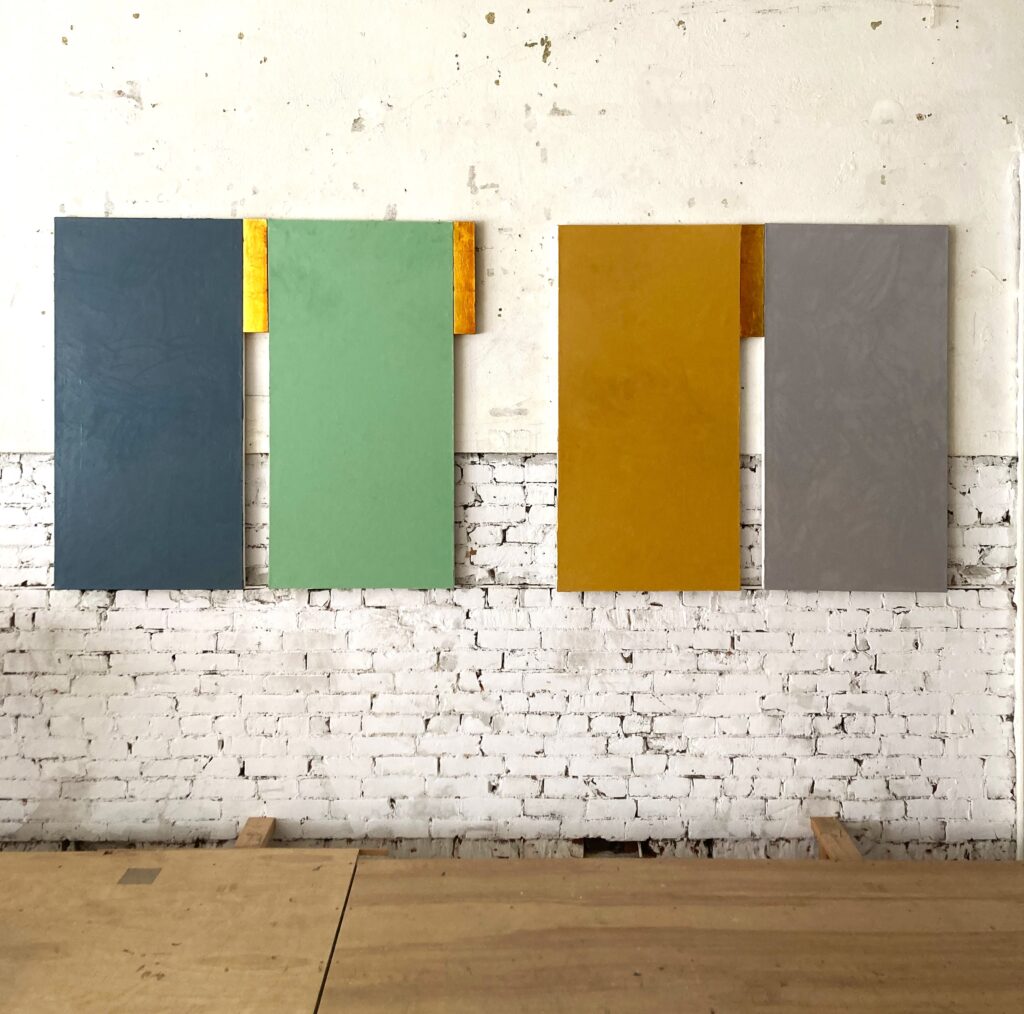
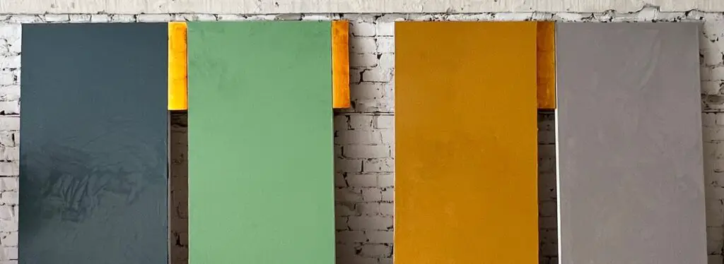
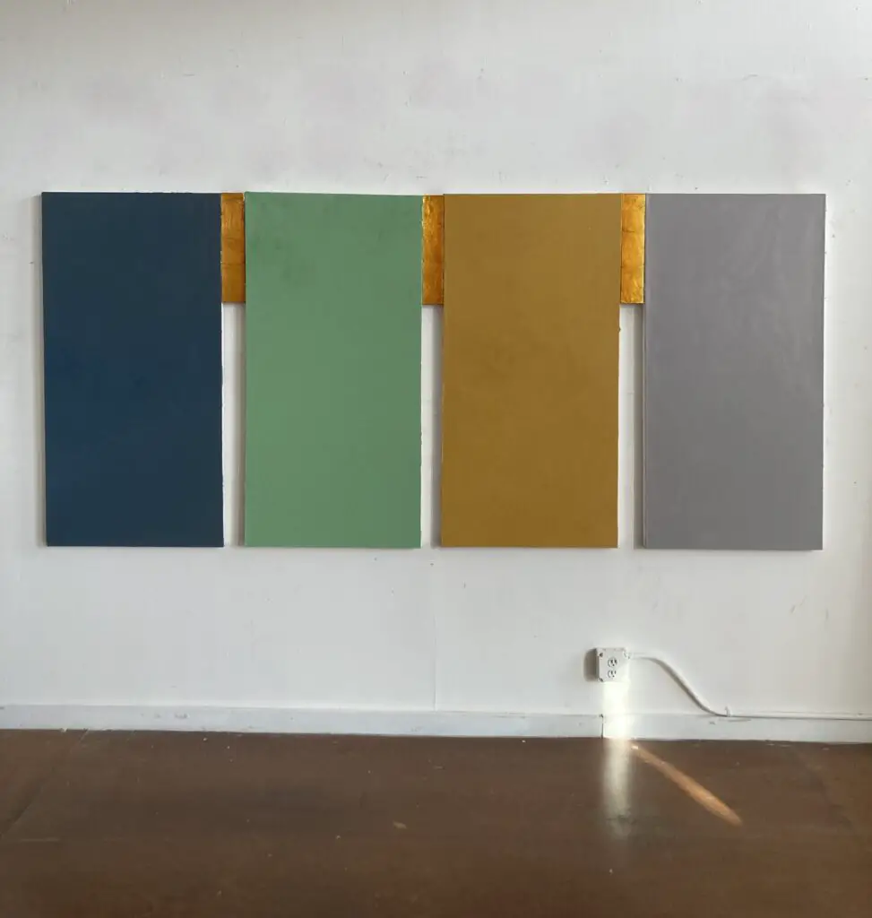
Four seasons. Four compass points. Four classical elements. Four base pairs of DNA. Across four decades Steve has practiced and taught the alchemy of Art.
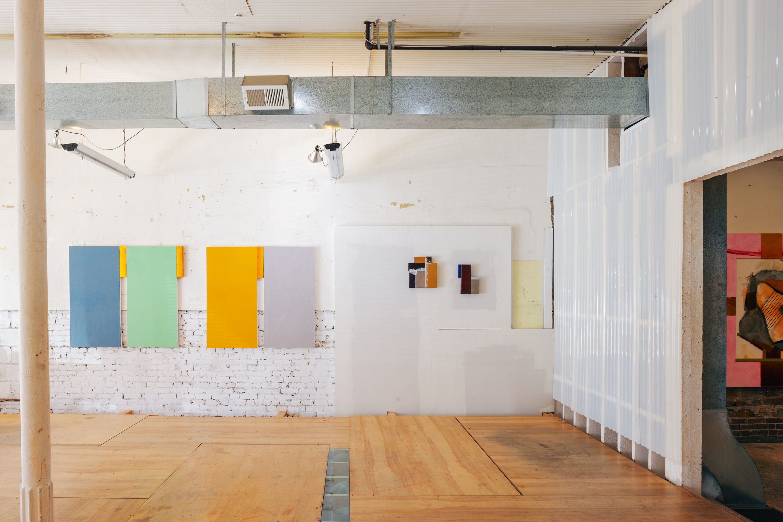
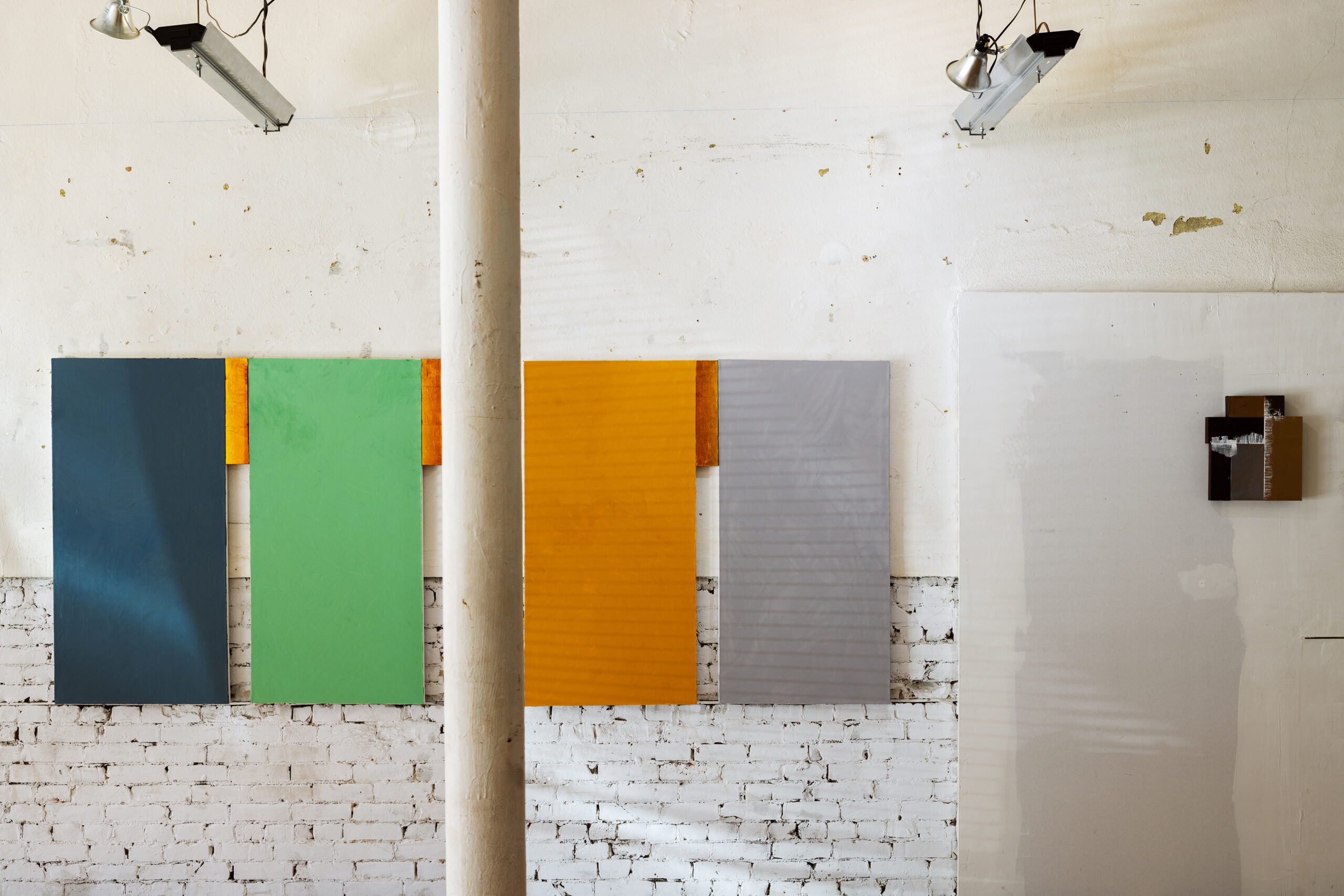
Seasons Installation View
Each of the four different coloured panels of ‘The Seasons’ not only represent the quarterly changes punctuating the annual climatic cycle, but may embody four different places in which the artist has lived and worked. Distinct locations may be suggested by the tones of soft green, warm yellow ochre, cool slate and thunderstorm blue hue. Heading East, from the American Midwest to the UK, on to Norway and south towards the Mediterranean, each coloured panel suggests the passing of time as defined by different geographical regions.
‘The Seasons’ can be interpreted as a record of the artists’ own movements through Time and Space, across Oceans and Continents, a transnational appeal from a lifetime of travel and search. Yet these records, akin to layers of rock strata, equally exist in the present moment and reach back through Time to the once-present ‘Now’.
Like a quartet of Neolithic stelae – inscribed with hand carved messages and whittled down over centuries to smooth, even frail flatness – or mysterious Celtic standing stones indicating the passage of the firmament’s astral beings – the harmonious composition of four panels gives the impression of musical notes set to the grid-like lines of a stave.
Interspersed with the promise of a golden half-silence, a bass drone, or a spinal chord of gold – a connective hinge of threaded light – these gaps, or margins, offer a rhythmic pattern. A bridge between different shades of verses. As regularly spaced as a metronome’s even swing, these golden sections traverse the close distance between these separate components marking time and space.
With our ability to see only the effects of time, such as cracks gathering in the varnish of a thirteenth century Icon painting, could Steve’s ‘The Seasons’ be a way to visualise what we cannot see – the ‘Fourth Dimension’ of Time?
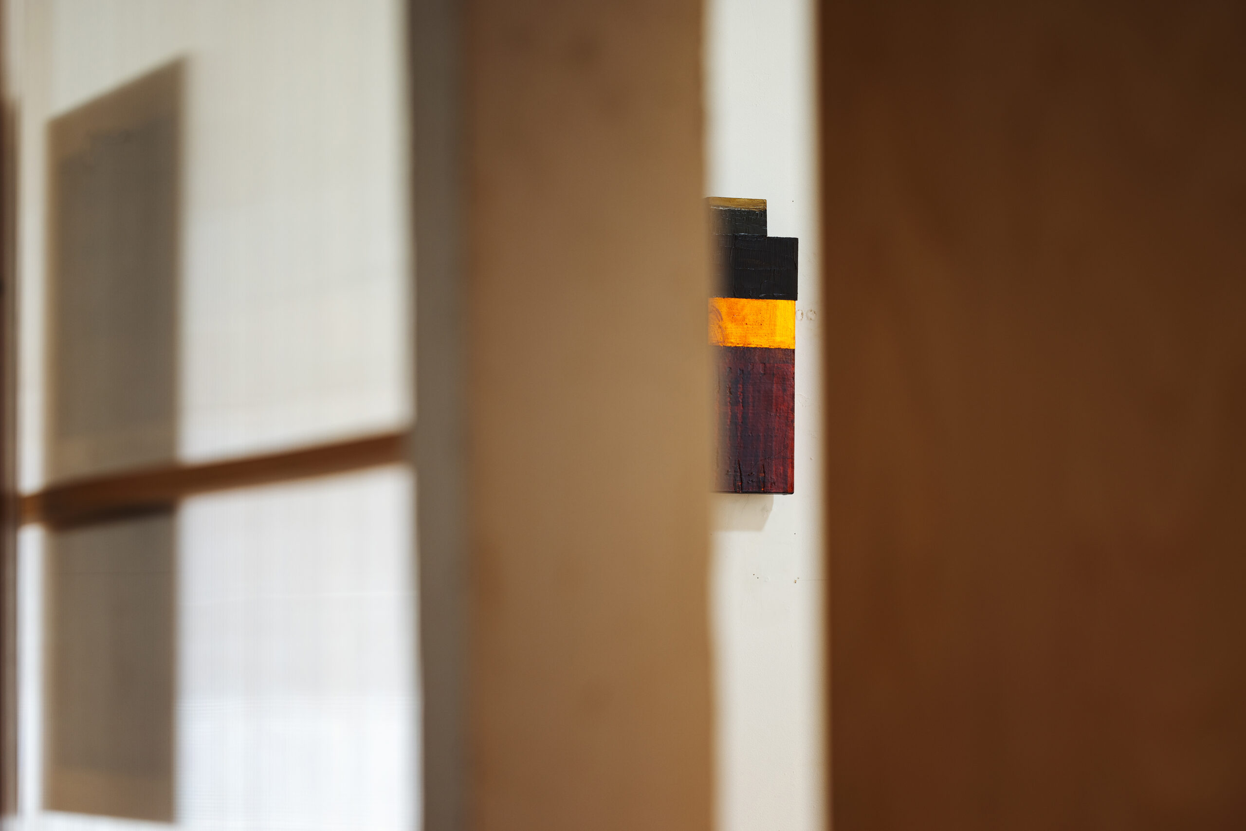
Steve’s signature stripes and squares are reduced to singular blocks of colour, the underlayers of Cubism, or the rules of a coded pattern. A pattern reflecting the structure of DNA as its spiral unwinds for the process of Transcription. Each of the four coloured panels could be considered as representing one of the base pairs of DNA:
– Adenine, frequently represented as ‘A’;
– Thymine or ‘T’ which pairs with A;
– Cytosine, coded as ‘C’ which can form hydrogen bonds with
– ‘G’ or Guanine.
With our contemporary sense of strict order, pixelated imagery and streamed sound, the painting rests like a representation of an unravelled strand of DNA – life’s, and Time’s – rulebook. We are invited by Steve to look and to consider the complex marvel of our own essence.
Meanwhile, The three smaller panels of gold act like the structural phosphate sugar bonds between the base pairs of DNA. Like the rabbit-skin glue of a portrait; the Punctun notes of a Gregorian Chant Notation, or a quantum time-space equation, these clasps of gold fuse the four separate entities together and create meaning within the entropic ether. Sense is drawn from chaos, and truth plucked from the void.
Steve reveals a process of divine geometry, but is it enough to carry the poetry of the passing of Time and the changing Seasons?
Seasons in the Artist's Studio
In Borges’ short story ‘Tlon, Uqbar, Orbis Tertius’, the imagined country of Uqbar has a history of legends which tell of Tlon, an imagined planet where no sense of past, present or future exists. Only the ‘now’ can be perceived. Books, a compass, coins and a dense metal cone inexplicably materialise in the ‘real’ world of the story’s narrative having broken through from the imaginary planet. The ‘real’ world of the story gradually becomes Tlon itself. Steve’s painting ‘Uqbar’ offers a plausible impression of this fictional country. Just as the strange artefacts from Tlon transcend Time and travel from an imagined past to a pre-conceived future, Steve’s painting of ‘Uqbar’ echoes Borge’s fictitious sense of Timelessness and paradoxically becomes Time itself.
- C -
C o l o u r
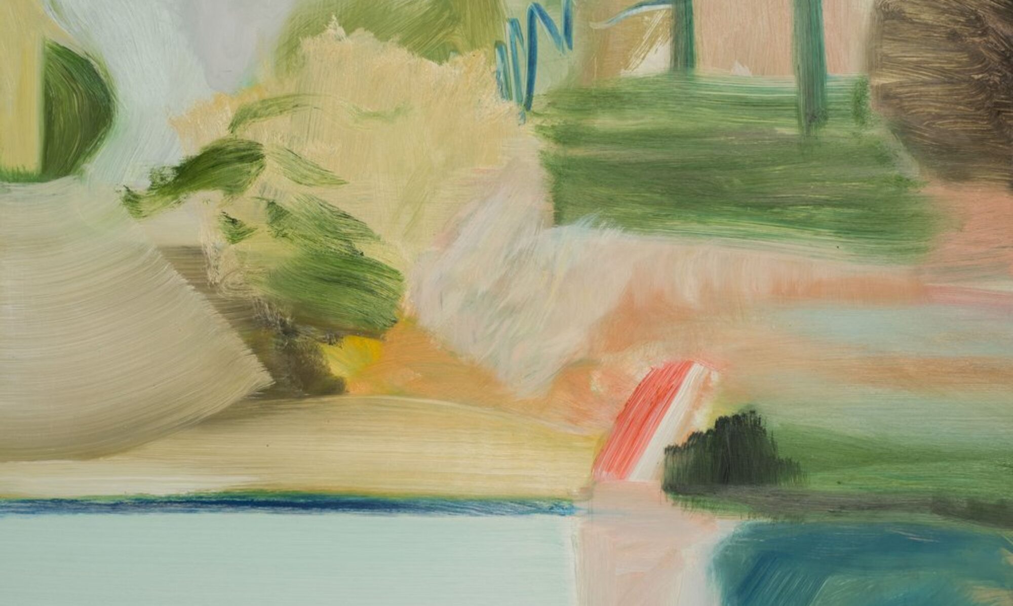
Neither stone, nor quite marble, pollen, foliage or rainstorm in tone, the canvas panels of ‘The Seasons’ become foundations, perfectly proportioned rectangles of pure, almost uniform colour inviting us to enter a trance-like state.
Waterbound Blue, Stonebound Grey,
Earthbound Green, Lightbound Yellow.
A colour symbiosis is attained, striking a cool and harmonious neutrality. Steve takes his cue from the early abstract paintings of Brice Marden. We think of Marden’s planes of meditative shades in works such as ‘Nebraska’, Steve’s own expansive investigations into colour a search for meaning from tonality. As such, the very colours of ‘The Seasons’ become a sort of homage, a tribute to the feel and spiritual quality of Marden’s vision.
Even Marden’s technique has been revisited by Steve. A little melted wax was stirred into the wet paint before being brushed and smoothed. See how the wax pools across the surface?
Like the resistance of a drum skin, yet restrained in richness. Evoking the light and classical radiance of a Grecian reverie.
The serenity of the colours in ‘The Seasons’ are contrasted by the tension evoked in the painting ‘Uqbar.’
A field of brown velvet – neither buffalo hide nor cavernous lair – recedes into the background as mysterious and brooding as the aura of an Aztec burial ground or a sacrificial Mayan Temple. You can see the beads of Terpinol, like summer’s dew, its humid breath resting on buds and leaves, or rain spots quivering on a mammal’s fur.
The curves and layered lines of bitumen, copper and silver hover ghost-like, as the gestures of a secret language – perhaps one such as exists in Borges fanciful ‘Tlon’…. Yet this is no random arrangement. Each coloured mark is carefully considered, the tones of brass and reflective shine restrained for an almost hypnotic effect. We may think of the narrator of Borges’ short story: perplexed and even a little disorientated by the discovery of coins, a compass and a metal cone from a so called ‘imaginary’ place.
And that little spot of red!
JMW Turner, Helvoetsluys ship going out to sea 1832, Oil on Canvas
A reminder of JMW Turner’s antics at the 1832 RA Summer Exhibition. So as not to be ‘upstaged’ by Constable’s scarlet flecked bridge scene, Turner astonished the crowds by adding a bright red buoy to his fresh-toned Helvoetsluys Seascape, entirely altering the work’s perspective. This little daub of red jolts the rich shades of Steve’s picture into focus.
The sumptuous regal red and dazzling gold of ‘Cope Robe (Perugia)’ find their origins in a priest’s vestment Steve saw in an exhibition of sacred textiles in Bern, Switzerland.
Commissioned for St Margaret Mary’s Church in Omaha, the richly textured application of red paint – with a hint of magenta – shimmers like silk. The memory of seeing a religious artefact of the sixteenth Century is transposed into a contemporary work of symbolic spirituality. From the colour of roses, of love, to the shade of blood and sacrifice, the colour red perhaps owes its longstanding appeal in works of art to the early hunter gatherers. From the ceiling of the Red Horses and parietal boars and bison which roam the Cave complex of Altamira in Spain (dating from C. 34,000 BC) to the red rock carvings of Alta in the far north of Norway (created c. 5000 BC) the colour red can be associated with the earliest forms of image making.
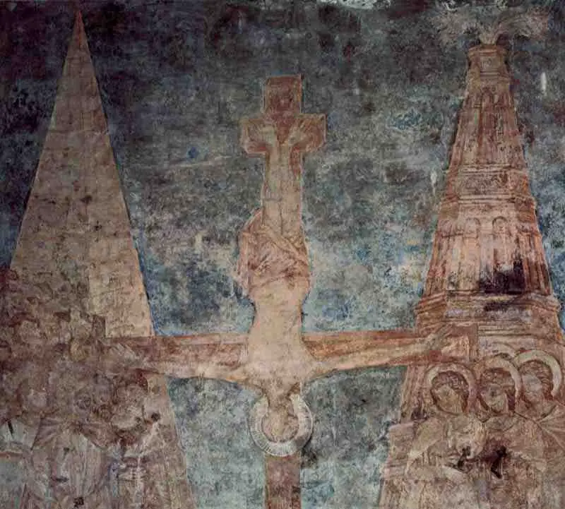
In the wittily titled ‘Barbara Hepworth’s Cimabue’ a frame of pastel pink surrounds an ambiguous form as though a slide enveloping a scientific specimen.
When based in Italy, Steve lived not far from Assisi, its Basilica walls adorned with Medieval frescoes by Cimabue and Giotto. Whilst Steve’s pink-burst enclosure calls to mind the crenelated turrets of Giotto’s pink infused castellos and buildings, it also makes reference to Cimabue’s remarkable fresco ‘The Crucifixion of St Paul.’ Depicting the Saint’s upside-down fate, the colours of this fresco in Assisi have faded and disintegrated over the centuries to reveal areas of bare pink-hued plaster beneath.
Steve has inverted Cimabue’s topsy-turvey crucifixion scene so that the cross shape represents a golden plinth, holding up the central canvas insert.
Cimabue, Crucifixion of St Peter, 1280 - 1283, Fresco, Upper Church of San Francesco in Assisi, Italy
Imbuing the quiet stillness of a Dutch still-life painting, a mysterious form rests in the middle of Steve’s work as though a tactile object laid upon a pink tablecloth. Spilling out around the central motif, Matisse-like, this pink table setting swerves the rules of perspective, the pink expanse stretching back so as to be absorbed by the wall behind. Orange streaks (Schnabel-esque) appear like patterns in the fabric. A painting such as Matisse’s ‘Still Life with Pink Tablecloth’ (1924-5) is brought to mind, the patterns of the cloth even echoing Giotto’s turreted forms in the Assisi frescoes.
Matisse, Still Life with Pink Tablecloth, 1924-5, Oil on Canvas, Kelingrove Art Gallery and Musuem, Glasgow, Scotland
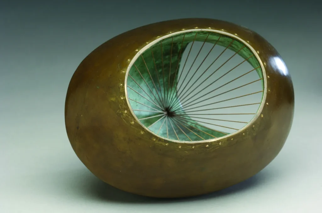
Meanwhile, coiling, fossil like, the central form in Steve’s painting can be viewed as an ode to the sculptor Barbara Hepworth; a post-war pioneer of Abstraction, based in St Ives, Cornwall, not far from Steve’s birthplace. Whilst the enigmatic form recalls shells or bones, the ink lines of tension are borrowed from the sculptural forms of Hepworth herself.
Barbara Hepworth, Sculpture with Colour and Strings, 1939
Steve’s layers of thin bronze paint echo Cimabue’s ageing frescos; you can see the canvas beneath – like a tear in the fabric of a pink patterned tablecloth.
The force of abstraction bursts through the stucco-like backdrop of pink as through a seismic tremor. We first meet Cimabue in Vasari’s ‘Life of the Painters’ (1550) at a time when all of Italy trembled from earthquakes, just as its historic pink toned buildings have been shaken in more recent years.
Medieval frescoes meet 1920s Provence meets post-war St Ives, meets contemporary Omaha in a pink paradise.
- G -
G O L D
The two mirrored motifs of gold in ‘Cope Robe (Perugia)’ float like hieroglyphics on an ancient Egyptian tablet. Angular with curving bases, the forms appear almost archaic in character, like the cheek guards of a Roman Centurion’s helmet, or the metal remains of a Viking’s shield, exposed in red earth during an archaeological excavation. Symbolic in stature, the two separate forms could even be the insignia of a secret society. There is a suggestion that these two halves of gold are reaching out towards one another, stretching to try and touch; an embrace across a red divide of Time. But could these forms, in their armour-like stance also be seen as majestic wings?
The golden wings of Icharus perhaps?
As in Ovid’s own words of ‘Metamorphosis,’ these heraldic components of gold, shimmering behind layers of varnish, morph into the wings of Daedalus’ invention. Fashioned from feathers and wax, Daedalus devised one pair for himself and one for his son Icharus so that they could fly away to escape captivity.
Consequently, the ink lines in the centre of the pink hued Cimabue painting take on a different role. Daedalus’ creations were supposedly so life-like that they invariably came to life and had to be tied down – the ink lines of ‘Barabara Hepworth’s Cimabue’ could now be seen as lines of entrapment, rather like Gulliver, pinned down by the people of Lulliput. We notice how the abstract form in the centre of Steve’s pink field is so full of life that it has come alive….. And wait, those same diagonal lines appear like tethers, crossing the gold patina of these winged forms too!
Joni Mitchell’s reference to ‘Icarus ascending’ in ‘Amelia’, conjures Icarus’ tragic fall into the depths of the Sea after flying too close to the Sun and joins Cope Robe Perugia in retelling a Greek myth in a contemporary way. Tragedy, desire and hubris are explored through the language of American Abstraction as the soft glow of Byzantium gold embeds another layer of meaning into the work.
Considering Steve’s frequent use of wax in his Icon inspired paintings and in those such as ‘The Seasons’ – not forgetting his own frequent travels – could these even be the wings of the artist himself?
Steve’s own means of escape not to the Sun, or to the blue of the Icarian Sea, or even to the pull of the equator, but an escape from the everyday to discover a new sense of elevated spirituality? The wax of Daedalus’ wings is transformed into gold, into the golden radiance of the Sun itself.
Steve’s use of Japanese gold leaf suspended in time under layers of honey-like varnish does not replace Nature or the Spiritual with the gilded decoration of lavish excess. The material splendour of Steve’s paintings is more akin to the vibrant veils of the Northern Lights, the golden shades of untarnished brilliance – the gold of the night’s sky.
The painted surface is imbued with Nature and Spirituality, the enchanting appeal of the mysterious and the sacred. An access point, a window or a portal to a place of transformation is offered. Whether to the Elysian Fields of the Greek gods, the Vikings’ Valhalla, or the uncreated light of our own dreams and searching, the impossibility of the architecture of flight is tethered and presented to us in the form of a memory of a golden robe.
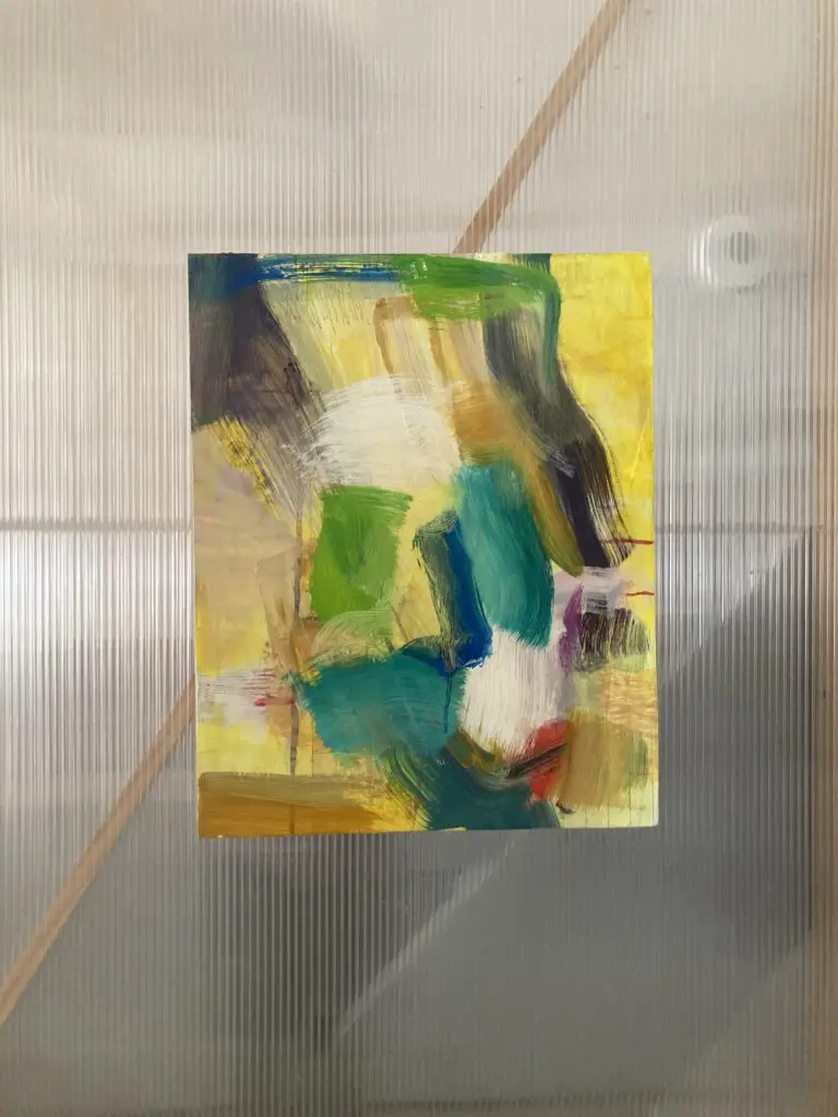
Elysian Fields (Yellow), 2017 - 2024, Acrylic, Ink, Pencil and Oil on Board, 20 x 16 Inches, 51 x 41 cm
One of my paintings is also exhibited in ‘Seasons’.
One Reply to “‘ ATCG ‘ – Artistry, Time, Colour, Gold”
Pretty nice post. I just stumbled upon your weblog and wished to say that I have truly enjoyed surfing around your blog posts. In any case I抣l be subscribing to your rss feed and I hope you write again very soon!


Pretty nice post. I just stumbled upon your weblog and wished to say that I have truly enjoyed surfing around your blog posts. In any case I抣l be subscribing to your rss feed and I hope you write again very soon!