Spot a red elephant running rampage along the gallery walls, paint splattering from every direction across the canvas in their wake. Wink at the paper cut-out girls in red satin, cheekily posing between trees as footballers enjoy a kickabout in the corner of the gallery space, their hairy legs on full show for all to see.
Bird, Lemur and Elephant, 2016, Oil on Canvas, Private Collection
Rose Wylie’s solo exhibition ‘The Picture Comes First’ is a playful, cheerful and somewhat tongue-in-cheek presentation of this 92 year old’s imaginative practice.
Many pieces in this exhibition have been crafted using collage techniques and thick oil impasto. Text in childlike scrawl offers observations, descriptions, instructions and thoughts, wrapping across the canvases like TV subtitles – a narrator to these compositions of joyful mash-ups. It’s a riotous festival of colour, humour and feeling.
Red Twink and Ivy, 2002, Oil on Canvas
Drawing inspiration from her experiences of growing up in London during the Blitz, of popular culture and fairytales along with newspaper stories, biblical references and more, we enter a world pulsating with the mischievous energy of a true artist rebel. It’s fascinating to think what Joshua Reynolds would have thought of Wylie’s unanatomical creatures and insects as big as houses!
Cosy up in a castle and idle away the hours in a unique hotel setting.
Remember that time you slept like Sleeping Beauty in turreted luxury?
Disclaimer : This Pendour article may contain affiliate links. This means Pendour may earn a commission should you chose to sign up for a program or make a purchase using our links, with no extra cost to you.
Whispers of Italian folklore intermingle with the ambience of an authentic stay within the walls of Castello Valenzino.
A gate near a curve on the road to San Giovanni del Pantano leads guests up to a grey hulk of ancient stone, set within a few acres of terraced gardens. Bees buzz, busied with the sweet scent of abundant lavender, whilst olive trees gracefully brush their ashen green foliage against the medieval walls in rhythm to the Umbrian breeze.
LA STORIA
Perched on the verdant hillside as though an illustration from Basile’s Pentamerone, Castello Valenzino seems to belong to a fairy tale set in some far-off land. It’s easy to imagine courtiers with pointed hats and bustling dresses prancing through the rooms, knights on horseback approaching from the nearby towns of Umberide and Assisi, bread baking in the immense stone fireplaces.
A stay at Castello Valenzino feels like stepping into a story set in the past. It captures the imagination, stirs the deepest romance and evokes the timelessness of Italian elegance.
CASTLE CHARACTER
Almost like a structural fortress, historical walls flank the Castello’s central tower to reveal an archaic past. Dating from the thirteenth century, early records indicate the castle was once a sacred site. Later documents point to Castello Valenzino as a noble residence for hunting trips. Today, the royal and the rustic converge through sympathetic restoration.
Renovated as a charming accommodation option, Castello Valenzino offers a mixture of independent apartments and rooms. Each chamber retains period furnishings to provide an authentic atmosphere replete with original features.
Seeped in an air of aristocratic resonance, the castle still boasts exposed ceiling beams carved from the most ancient of trees. Thick walls of exposed stone along with steep staircases exhibit the architectural style of the medieval age. Arched doorways and narrow slit windows – just wide enough to shoot a bow and arrow from – testify to the castle’s once strategic identity. It’s like travelling back in time to another world!
Even with all these incredible features from a bygone age, the Castello still caters for its contemporary guests with all twenty-first century expectations – electric lights, hot water and reasonably good Wifi – so even the most aspiring of knights can feel at home within these castle walls. Inviting beds with fresh linens and soft towels ensure comfort along with room fans and blankets for whichever season you visit.
Meanwhile, modern day indulgences include jacuzzi baths in several rooms for a touch more lux, a wine cellar for organised tastings and the benefit of a small kitchenette in a select number of suites – the perfect option should you wish to stay for longer as ‘Lord-and-Lady’ of the manor!
Whilst the larger suites offer even more character with their open fireplaces and private outdoor terraces, the double rooms are bigger than usually expected for such an ancient setting. The Torgiano Room opened out into a tasteful lounge, an entire suite with a sofa and TV room leading on to the bedroom. A spacious bathroom with ample shelving completed the set up with views overlooking the valley.
The furniture is tastefully on cue in its stylish simplicity; it is evident that the whole site is impeccably clean and well maintained. Dried flowers placed in vases catch the eye, little offerings as though Medieval Morandi’s, echoing the artist’s gentle tones with the addition of sparing glints of crimson and ochre petals – coloured jewels in the castle’s holdings.
Castello Valenzino presents historic allure and inklings of magical lore, induced in a world of relaxation, rest and rejuvenation. Fling open those narrow windows and breathe in the scented Italian air! Take in the glorious views of the rolling hills! Marvel at the blue sky dancing far above! Survey your kingdom as the sun sets lazily in the quiet of evening.
Slip into slumber inside your castle room, secluded by the thick stone walls with history in their heart. Rise with the sound of birdsong and the hum of cicadas, refreshed and ready to take in the grandeur of the landscape and all that Umbria has to offer.
A STATELY SETTING
Prance out into the Castello’s gardens. Seek shade under the little pergolas or parasols lining the swimming pool. Although small in stature, this square of blue sparkles like a topaz in a tiara under the Italian sun. Plunge in to cool off and refresh as you take in the Castello’s surrounding views. . . .
Golden fields of honeyed linen gracefully drape the hillside, wrapping its dells in their folds of wheat and corn. Luscious thick forests border this harvest, as though a ruff around a Venetian merchant’s neck. The depth and darkness of the glade hides mystery in umber tones. Could this have been King of Woody-Valley’s castle, father of the unhappy princess?
A little stream runs in the darkness of the wooded hollow – as though running tears to fill a jug for awakening the beloved – the Valanzina beck from which the castle receives its name.
BEYOND THE CASTLE WALLS
Castello Valenzino is the perfect base to unwind and enjoy exploring ‘The Green Heart of Italy’. A region famed for its vineyards, truffles, pilgrimage sites and an annual jazz festival, Umbria is the authentic alternative to more crowded destinations. Breathtaking views and warm hospitality along with the slower, more relaxed pace mean Umbria offers something a little different!
A view of Gubbio from the funicular to the Basilica of Saint Ubaldo.
Assisi, Gubbio, Perugia and Montone. So many historic towns and villages sigh in unison with Castello Valenzino. Discover fine dining beneath terracotta tiles, fashion in full swing through the winding streets and Basilicas decked out in renaissance splendour.
Umbria is the birthplace of St Francis of Assisi. With the UNESCO complex in nearby Assisi, this certainly helps to put Umbria on the map as a major centre for Christian pilgrimage and spirituality. Marvel at Cimabue’s masterpieces within the apse, spectacular examples of Byzantine Art.
A view of the Basilica at Assisi
Eager for more?
For your fill of spectacular medieval art including icon paintings and exquisite predellas as well as special exhibitions, head to the Galleria Nazionale dell’Umbria. Housed in the beautiful Palazzo dei Priori, seat of the City Council since the Middle Ages, the GNU is the only Italian public building to house a national museum.
And oh what treasures await!
A view inside the Galleria Nazionale dell’Umbria
For adventure seekers Monti Sibillini National Park and Lake Trasimeno offer the chance to get close to wildlife whether hiking, biking or swimming.
Looking down on a view of Lake Trasimeno.
From olive oil to Deruta ceramics and Montefalco linen, artisanal souvenirs reflecting Umbria’s traditional craftmanship, famed since the middle ages, can be found on almost every street corner.
And for chocolate lovers, don’t miss Perugia! Europe’s largest festival dedicated to chocolate – EuroChocolate – is held here every year, following the tradition of Lusia Spagnoli’s Baci Perugina – hazelnut treats inspired by Hayez’s painting ‘Il Bacio’ (The Kiss), complete with a lover’s message.
Now that’s a contemporary Fairytale!
An assortment of Perugina chocolate tins in the Galleria Nazionale dell’Umbria
And if you fancy a personal tour to discover more of Umbria’s hidden gems, museums and historic sites, consider booking a knowlegable and multi-lingual local via Go With Guide. From photography to Vespa themed tours, Go With Guide‘s tour leaders present special opportunities to learn about the regional way of life in a fun and relaxed way, matching your personal needs and interests.
PENDOUR PRO-TIP
It is essential to hire a car, or moto, to reach Castello Valenzino. The location is quite isolated and this part of Umbria is very hilly! The nearest shops and restaurants are good 15 minutes drive away, so be prepared to navigate narrow streets – you can’t go wrong with a Fiat 500!
CASTLE COLAZIONE
Breakfast is served early at Castello Valenzino and like many places in Italy, it is not a big meal! Fresh breads with butter and spreads along with croissants and fruit tarts are available, served with coffee and juice.
Enjoy colazione in the privacy of your suite or dine in the banqueting room, surrounded by tasteful tapestries, the elegant stonework a fair companion. Rough hewn walls and flagstone floors all add to the ambience of castle life!
STORIA ONIRICA
Feel like you’ve stepped back in time to a bygone age of damsels in distress, knights in shining armour and rural living. A stay at Castello Valenzino is a destination for sweet dreams in the Fairyland of the South.
Quietly tucked away in the heart of Norfolk, Fritton Lake is more than a hotel – a place where nature, slow living and wellness come together. In this review lakeside swims, woodland walks and the warmth of a floating sauna unfold like wintery scenes in a short story, a seasonal tale of lakeside life.
AN ARRIVAL
The tree-lined driveway curved slowly through the parkland. The greying branches met overhead like the ribs of a cathedral ceiling. Their dark silhouettes stretched across the winter sky, silently criss-crossing like Nosferatu’s interlacing talons.
At the end of the avenue our travellers approached a brick building with its façade painted a welcome shade of yellow. For a moment she was reminded of time spent in Sintra, where brightly coloured walls gleam in luminous brilliance beneath a topaz blue sky.
Here, however, the warming earthy shade, touched with hints of ochre, perched solitarily and glowed softly through the pewter haze. It felt unexpectedly cheerful, a small burst of colour folded into the Norfolk Winter. A honeypot poised within the umber tones of the surrounding parkland.
Decorated as though a carnival top, with blue and white stripes climbing the wall and continuing across the oval ceiling above, swirling outward from a miniature chandelier, the entrance foyer was smaller than expected. Had they somehow stumbled into a chapter of Alice in Wonderland or a scene from Gene Wilder’s chocolate haven? Their arrival was starting to feel like the beginning of a story.
As they crossed ornate carpets breaking up the flagstone floors a relaxed and quietly chic atmosphere – very much muddy-boots and dogs-and-horses – greeted our travellers. Framed artworks from Fitzroy Modern Art Gallery paraded along the staircase and over the upright piano. Radiating a sense of exclusivity, these pieces presented an interesting contrast to the immense pike glistening inside a glass vitrine above the fireplace in the Billiards Room.
The Clubhouse at Fritton Lake felt really just that – a meeting space for those in the know. For nature lovers in search of the comforts that belonging to an exclusive group offers – minus all the fuss, rules and tight-lipped frowns judging apparent interlopers! A rather unique club-like feel!
As they checked in, our Fritton first timers received electronic wristbands, which they understood would give access through some of the gates further away on the estate. A friendly staff member answered their questions relating to parking, breakfast and exercise classes; all laid-back and centred around a casually good time. They were shown to their room upstairs decked out in a shade of sage green – as warm and comforting as could be on a chilly Tuesday in January.
Our guests glanced around the room, taking note of the TV set unobtrusively in the corner, thankful for its inconspicuous presence. A framed work on paper with emerald green leaf-like forms held the main wall, complementing its sage-hued shade.
Original features such as the Georgian sash window elegantly matched the snug-looking bed. A curiously arched door, nestled between two oak beams – again like something from Alice’s adventures, led the way to the en suite bathroom. Our guest smiled as she spied a heated towel rail and plenty of space to lay out an array of skin care saviours despite the estate’s offering of delightful, sweet-scented Bramley shower gel and hair-smoothing shampoo and conditioner. A pleasant surprise for any guest!
SENSATIONAL SHOPPING
Content with their room but realising they had forgotten to pack toothpaste, our travellers decided to explore. Arm in arm they strolled past little gardens bordered with cute box hedges to Valentine & Silver, the estate’s shop set in a renovated barn.
Browsing the products with gusto they were impressed by the range of minimally packaged soaps and toiletries, along with a delectable-looking selection of local wines. ‘If you were just dropped here, with only a swimsuit, it wouldn’t matter’ she thought, as everything – even beautifully knit scarves, jackets and socks – could be found lovingly presented next to sustainably made greeting cards, children’s hair ties, local honey, sweet treats and fresh milk, cheese and organic eggs.
A Secret Garden?
Gliding along the avenue of pleached trees she passed the tennis and badminton courts on either side. Presently, she approached what appeared to be a walled kitchen garden, now transformed into the pool and solarium. Rustic huts at either end of the 22 metre expanse of shimmering light blue appeared as though gingerbread cottages, replete with gabled roofs and even outdoor fireplaces for those chilly days! Within these biscuit barrel abodes were farmhouse style changing booths with welcome underfloor heating and large shower rooms.
First opting for a chance to check out the sauna, our guests proceeded through a gate in the kitchen garden wall. Taking in the expanding view they made note of how the grounds were carefully trimmed, weeded and tended for the Winter Season.
A bronze depicting a youth – arms outstretched to the heavens – inhabited the sloping lawn and was accompanied by a plaque referencing loss of life during the World Wars. Who had once lived and worked here? What were they like? Was their presence still felt in the biting cold and washed-out sky, just out of this youngster’s reach?
The wall of ancient red bricks revealed a shabby-chic lean-to on its other side. The glass panes mostly still in place, the potting shed structure lent itself to a make-believe of lovers’ clandestine meetings, rolling on an imaginary spool of black and white faded glamour. The old-worldly feel gave chance for whispers of the past to permeate. Could there have been a secret love affair or a Go-Between? A quaint idea.
Approaching the lake the temperature dropped a little more. As they stepped out onto the jetty a tablecloth of rippled velvet stretched as far as they could see to the left and right, the scene framed by the droops of weeping willows like veiled curtains. The curvature of the opposite bank meant they gazed across a crescent-shaped lake. A body of opaque fresh water, recalling the Radiohead album – A Moon-Shaped Pool.
Despite the occasional ripple of dark, peaty tones, the view seemed still and silent. A moment hanging unhurried and unspent. She imagined what the view must be like in Summer: the mottled tones of grey instead infused with green; the dark shade of the lake transformed to the Azul blue of the sky; blossoms along the banks; little ducklings of yellow fluff taking to the water.
A (Sunset) Sauna
Footlights led to a small black hut connected to the bank by a tip-toe bridge, almost like a scene from the Willow Pattern. Barefoot, she gingerly stepped along the path, wincing slightly at the sharp stones underfoot until she reached the bridge and finally across to her destination, the floating sauna!
A fiery orange glow from the crackling wood burner met our travellers as other Fritton Lake guests and club members shimmied along the bench to make space. Lower and upper benches made a cosy, sociable atmosphere. The heat rose. Skin feeling hot and dried, our nomads chatted with the other sauna sitters, learning about the park and hearing all about the cabins and what a treat it is to stay in one, nestled in the forest, or better still, to own one!
‘Yes, it’s a popular spot this’ remarked one of the ladies, before heading out. A moment later the sauna swayed as she dived deeply into the dark water. Aghast, the sauna sitters watched her through the large window, a single pane with unrivalled views of the silvery, lunar-like lake. The sauna rocked slightly until it regained its equilibrium. The woman re-entered the hut and the conversation, her dripping hair and skin quickly drying, glistening by the growing light of the fire.
The wood burner’s roaring heat made our nomad feel better, warmer, alive! It was like she had forgotten what it was to feel warm amid Winter’s foggy breath. Once she had plucked up the courage, she stepped out into the icy air, holding the steps as she lowered herself into the dark waters. First her feet, then allowing the water up to her calves and midriff. A deep breath. She closed her eyes. Shoulders in. Head under. Breathless. A burning sensation on her thighs. She bobbed back up for air, not letting go of the ladder. Elated, she took another deep breath and head under, once more. She had to prove to herself that she could do it!
Quickly up the steps and straight back into the desirable, welcome glow of the little floating sauna. Refreshed, feeling brazen despite the cold, emboldened by the fresh air and ready to test herself – Wim Hof style. After this initial timid scuttle into the peat-dark water, she decided to have another go. Jumping in from the ledge, just beside the window. Her body tensed as it hit the water, breaking the granite-hued surface. That sinking feeling, for a few moments the world seemed to stand still except for the descent. Then her head emerged back above the water line, a deep breath in. Clearing her fringe out of her eyes, she looked around the lake, taking in the darkening view, lifting her arms as though to see what would happen as the tingling sensation set in.
She rounded it off by blasting out a good twenty lengths or so back in the heated pool of the walled garden, steam vaporising off the pool’s teal top. She must always swim lengths in a pool. Wide, deep and long, the Fritton Lake swimming pool was perfect for front crawl drills, tumble turns and finally a cool-down. She completed her set lengths as the darkness grew around her.
Mist from the pool cast strange clouds in front of the wrought iron gate, the red brick wall now more brown in the twilight. Breathless, grasping hold of the pool ledge, she could hear the crows cawing in the distance. Completely alone she glanced at the open gate, its wrought iron design wreathed with tangled trees and spidery branches. The witching hour had begun.
EVENING GROWS
She drew back the plush curtains in the sage coloured room, closing out the receding light to prepare her outfit for dinner with friends who live close by. ‘Had I realised how wonderful it is to be here at Fritton Lake, I would have certainly tried the food in the pub’s dining room. But this treat will have to wait until a summer visit!’
Following an enjoyable evening she was reminded of other excellent hotel experiences, too good for photos and words… places that have a distinct feeling, where you feel immediately at home though all is new and exciting and yet to be discovered. On reflection, she decided that Fritton Lake was a little like a place she once stayed in in the Dolomites, or at the venue of the wedding of the last decade, hosted in Oxfordshire. But with its chilled vibe and lake-life focus, this new discovery of Fritton, just two hours out of London, hits the top!
AND SO TO BED
Tucked into the cosy white bed she enjoyed a few more pages from her book, glanced through the local ‘Living In Suffolk’ magazine and finished sipping a chamomile tea from the Teapigs chest. A bedtime ritual enhanced with the soothing sound of the Roberts radio, breaking through the quiet fabric of the night. The swim, sauna and ripples on the lake. . . . The wild, cool air – scented with grass and moss – lingered outside the window where bunnies roamed in frosty velvet darkness under the fleeting clouds and star-spangled sky.
GOOD MORNING!
As our guests awoke they opted out of the breakfast offering, despite the occasional scent wafting up from the restaurant below and along the corridor. An empty belly was better for her plan – an exercise morning!
Following a strong cup of coffee fresh from the Kofra Koffee tin (no plastic here!) and brewed in the cafetière supplied – nice touch for a hotel! – she packed away her belongings to meet the required check-out time and headed over to the gym for a dance and body sculpt class. The gym was clean and orderly, the machines of a high-spec with aesthetics also in mind! You could work out to views of the parkland, whilst around the corner the open hall featured wall bars and mirrors.
A little apprehensive, the ecstatic instructor put everyone at ease and then the music started. Pumps and samba, box step and Riverdance – all to the riffs of well-known favourite beats. A fun-filled (if rather sweaty!) way to begin the day. A few other members and guests joined in, with barre fitness to round off the session, hoisting weights above whilst in plie and développé.
Following a little chat afterwards, saying farewell to the other members of the class was like saying goodbye to well-known friends. She decided to head back out to the lake and couldn’t resist another sauna session with two more lakeside plunges, each time a little bolder, despite the ominous pike flicking near the surface, whipped up in the arctic wind.
Today, the blackened water seemed reminiscent of a Norwegian Fjord, or perhaps Lemony Snicket’s Lake Lachrymose minus the leeches of course! The muted tones looked even harder in the cold, after the frost. Along the opposite bank pines dressed in furry green attire dwarfed the naked branches of the deciduous trees. A final few lengths in the pool saw our guest shower off in the beautifully heated gingerbread changing rooms before heading to the Clubhouse.
Here, from the comfort of an armchair she enjoyed a creamy bowl of celery soup beside the crackling fire. Now that’s a Winter’s morning well spent!
FAREWELL, FRITTON
With yoga classes, nature safaris and even foraging sessions there’s yet more to enjoy and experience at Fritton Lake. A world of its own, an idyllic kingdom blending relaxation with a special opportunity to get close and connect with nature. Whether through incorporating freshly harvested ingredients from the land in their tasty dishes, fresh coffee in the rooms or produce in the shop, Fritton Lake has achieved a balance of adventure and relaxed effortless making each stay charming and exclusive.
If only it wasn’t already time to go! Passing through St Olaves and surveying the sweeping vista of the Norfolk Broads – pale and quiet in the Winter light – our travellers promised they would return to Fritton Lake.
Somewhere behind them, beyond the fields and trees, lay the dark lake – still and brooding, wrapped in the hush of the Season. A place of misty swims, crackling fires and cold-water courage. One visit had revealed only a single mood of the place; surely this nature retreat would transform as the seasons turned?
She imagined the jetty warm beneath her feet as dragonflies skimmed the watery world; the pool filled with laughter and gardens with colourful blooms bordering the estate’s shop and ball courts. . . .
‘Yes!’ she said aloud: ‘Winter was atmospheric. Summer would be the perfect time to return and savour the keen hospitality, comfortable beds, fitness facilities and the joy of lakeside life’.
To be continued with Chapter II ‘Summer’, later in the year.
Disclaimer : This Pendour article may contain affiliate links. This means Pendour may earn a commission should you chose to sign up for a program or make a purchase using our links, with no extra cost to you. We love the companies featured on Pendour Living and are sure you will too!
LOVE YOUR LAUNDRY
Laundry seems to be a given in life. No matter how conscientious we may be, stains, frays and accidents regularly occur! So, to avoid adding laundry to your long list of ‘chores’ or ‘housework’, we’re pleased to have found the Clothes Doctor to put Love back into Laundry.
The Clothes Doctor offers a welcome alternative to feeling overwhelmed and overcome with the garment monster lurking in the basket. Find solace in the soak, the suds and the spin. It seems so much more constructive to embrace the process of caring for your clothes, revelling in the fresh scent of revitalised knits, polished lacy numbers and buttery smooth sportswear, rather than fighting what can be a pleasurable part of daily existence.
Clothes Doctor is your laundry saviour, elevating a once monotonous task to the realms of the glamorous and the chic. Their dedicated range of detergents and spray mists airlift your senses to the likes of Sicily, Provence, alpine hideaways or even a Silk Road setting. Further nifty products make caring for your clothes all the easier, banishing those tell-tale pills of wear and pro-longing the lifespan of your favourites. All this to keep you looking and feeling good so you don’t have to buy more to squeeze into your choc-a-bloc wardrobe!
Unlike conventional laundry detergents which blend polluting and dubious ingredients in plastic pods and jugs – ultimately damaging our waterways and seas – Clothes Doctor strives for sustainability. A small UK business integrating only eco-friendly ingredients, Clothes Doctor helps ensure that your wash is not a wash out for the planet.
So let’s get to it, bring on the scented suds and soaking saviours!
ORDER & DELIVERY
I first found Clothes Doctor when searching for a special detergent to wash my shimmering pillowcases and eye mask from The Silk Collection. Used everyday, these items require regular washing to keep them top notch, especially as they can become a little discoloured from oils and face creams applied at bedtime.
Impressed by the Clothes Doctor’s website and sustainable credentials, I spotted exactly what I was looking for, a PH neutral detergent to maintain the delicate lustre of silk without potential allergens or toxic additives, all packaged without excessive plastic.
There is a minimum spend of £45 for free delivery. This may sound like a lot but it’s quick to get your basket up to this threshold… yes, the products are rather on the pricey side compared to supermarket standards. But this is what it costs to develop and manufacture wonderful products with the power to transform ‘doing a wash’ to prescribing just what the Doctor ordered!
Credit : The Clothes Doctor
Since my first purchase, Clothes Doctor have introduced an Everyday range, working out at just 30p a wash! Although these detergents and fabric conditioners are not specialised for particular clothing requirements, they are highly concentrated and have a lower price on subscription. Refillable glass bottles with metal nozzles mean there’s less spill and wastage once you’ve added some water. Delivered to your door, the Basil and Mandarin scent sounds as though doing the laundry will be a form of aromatherapy from now on!
PACKAGING
The products arrived in a cardboard box surrounded by noodles or nuggets. These completely dissolve when wet. The noodles reduce the need for polluting polystyrene or plastic-based packaging whilst offering the same amount of protection from bumps and jumps as the products work their way to save my silks!
Upon opening the box, I realised that the bottles of detergent were also wrapped in tubes of textured cardboard. Hugging the products tightly, they protect the delicate folds of the aluminium bottles near the base and follow the curve of the slightly tapered top. One of the aluminium bottles had received a bit of a dent on its merry way, but thanks to this cardboard sleeve the magical liquid remained intact!
The cardboard casings and a slight dent in one of the products.
All of the products – the Silk & Delicate detergent; the Knitwear Mist and Eco Liquid Baby Detergent – are packaged in rather cool-looking aluminium bottles. Endlessly recyclable and far more valuable than recycled plastic, aluminium replaces those toxic pods which leach chemicals into your skin as you handle them – and your clothes. The use of aluminium also reduces the need for giant plastic jugs of laundry detergents which either end up in landfill, the UK’s waterways or are shipped and burned in Asia!
Only the cap is made of plastic. Whilst these are great for measuring out just the correct amount of detergent, it would be wonderful if an alternative could be sourced, such as cork or another plastic-free stopper. Let’s hope the Clothes Doctor can find a way forward so we can entirely pass on plastic.
SLEEK N' SEXY
Not just better for the environment, the sleek and modern-looking aluminium bottles are also an upgrade for your home! Far more visually sophisticated than the giant plastic jugs with built-in handles, or goofy looking plastic tubs of pods, these products make classy additions to any kitchen or laundry room shelf!
The label design is clean and eye-catching and they’ve used some rather trendy symbolism, almost like ancient runes which continue onto the pattern of the scented drawer liners! This is a good move and matches Clothes Doctor’s commitment to sustainability and the idea of caring for and repairing our clothes, which of course dates back to our earliest history.
In addition to detailed instructions, the labelling also offers little rhymes and reveries, linking your laundry to the destination which inspired its scent! This is sure to add a smile and a little charm to loading your machine or agitating that bowl (for the second – no wait – THIRD time today, what mucky pups!).
CRAFTED IN CORNWALL
Upon closer inspection of these products I was amazed to realise that although Clothes Doctor is a London-based company, their products are manufactured in Cornwall! The land of our namesake and raison d’être, you’ll also find that the Clothes Doctor will make a special appearance on our Crafted In Cornwall post, coming soon!
IRRESISTIBLE INGREDIENTS
Clothes Doctor prides itself on using essential oils in their detergents and clothing mists. These are carefully selected to enhance the natural beauty and properties of fabrics such as cotton, wool and cashmere whilst reducing creases and offering protection from months. Natural oils such as lavender, cherry, bergamot and sandalwood are combined with slightly more surprising ones like cardamom and clove leaf oil. Blissfully combined, these crafted scents blend into a fragrant bouquet of pure intoxication!
Whilst industrially produced detergents often contain skin-irritating chemicals, the Clothes Doctor offers an opportunity to treat your skin, nose and clothes to the thrill of Nature’s pure aromas.
Years of testing, refinement and research has resulted in a range of products which care for what we already own. Over washing our clothes can lead to premature ageing of the fabric and the need to replace them too soon. The Clothes Doctor’s process of careful and considered development has resulted in a range of highly concentrated and super effective detergents and mists. A little goes a long way! Instead of harsh surfactants and sulphides, which damage both our clothes and waterways every time we load our machines, Clothes Doctor’s selected essential oils ensure a more natural approach.
Every formula offered by The Clothes Doctor is ingenuously mixed to gently clean without damaging fibres. This promotes that ‘nearly new’ feeling, maintaining the shape and colour of your cosy jumpers, poolside dresses and business shirts. The spritz and scented drawer liners also keep your clothes fresh between wearing so there is less need to wash certain items so regularly! A revolutionary idea: products that are designed to care for clothes, and not just clean them!
Each product is 100% vegan and cruelty free and the full list of ingredients can be found on the specification for each product.
A FIGHT AGAINST FAST FASHION
The fashion industry is responsible for 10% of all carbon emissions, more than that of aviation and maritime shipping combined! And to top this off, one truckload of clothes is discarded every second…. What an inefficient system!
Extending the life of our garments by nine months can reduce their footprint by a surprising 30%. This is where Clothes Doctor helps ensure that products are cared for and looked after, maximising the times you can wear that gorgeous blouse and one-of a kind jacket you picked out on your last travel adventure!
Have a special something requiring a repair? In need of new zips, buttons, patches and more? The Clothes Doctor have developed a network of clothes-caring seamstresses looking forward to putting some TLC back into your well-worn looks. Simply request a quote online and pop your clothing in the post and Clothes Doctor will take care of the rest! Repairs are expected to take 7-10 working days depending on the nature of what is required.
SEASONAL SCENT & PROTECT
Credit : Clothes Doctor
Clothes Doctor have recently introduced a quarterly subscription service. Every three months their subscribers – or patients! – receive a limited edition box of detergents, moth repellents and other accessories carefully curated to suit the season! Tuck away your chunky knits and warmers in the Spring with a spritz of Cedarwood and Vanilla Knitwear mist to protect against over zealous moths until the Autumn. Squirt some crease release over your chinos or favourite linen trousers as part of their Summer Edition collection. Await your Winter box, featuring another scentalicious range of goodies to preserve and protect your favourite looks. Alter and adjust to suit your style!
SPECIAL DISCOUNTS
Clothes Doctor also offers a range of exclusive offers :
NHS Discount
Senior Discount
Teacher Discount
Maternity Discount
So that those uniforms and ‘off-duty’ outfits can work as hard as you do!
Simply register on their website to secure your well deserved discount, just as the Doctor ordered!
(Of course we’re looking out for The Cultural Worker’s Discount to relieve our paint-splattered, mud covered, dust coated, loose fitting creative dress code! 😀 )
RETURN & REUSE
Clothes Doctor offer a 20% discount for returning their empty aluminium bottles. These can be mailed free of charge. For every 1 – 4 parts returned to the Clothes Doctor’s ‘surgery’ you can receive 15% off your next order, or 20% off for returning five or more empties. There is no limit to the number you can send back in one go, but to help improve efficiency, the Clothes Doctor encourages customers to collect at least five parts before sending back.
Although this information is relatively easy to find on the website, it would be helpful for customers to have these instructions on their order confirmation email, or a little message included with their Clothes Doctor products. Afterall, who doesn’t like to be rewarded for helping to reduce waste and embracing more sustainable practices!
A SOAPY SUCCESS?
So how well do the products I purchased from The Clothes Doctor scrub up?
Overall, the two detergents and Knitwear mist seem to cleanse and freshen effectively. I’ve also noticed a newfound super-smooth texture when retrieving my clothing from the washing machine, as though the fabrics have been magically purified and conditioned! This must be thanks to the essential oils which push back the clock on your style to that ‘nearly new’ phase!
SAVE YOUR SILKS
A silk eye mask from The Silk Collection
The Silk and delicates detergent boats a blossoming scent of sandalwood and bergamot. This eco-friendly detergent has a neutral pH to preserve the delicate fibres of silk fabric.
I went for the larger bottle, as I have rather a lot of silk – some from the bazaars in Pushkar – needing some TLC! This larger size has apparently been discontinued due to the plastic cap of the bottle cracking during transit, but the smaller quantities are ideal for travelling, whether in Tulum or Italy, especially if you don’t go anywhere without some goodies from The Silk Collection!
I found that the Silk & Delicates detergent successfully lifted oil and grime from my eye mask and mulberry silk pillowcase. I sometimes do a ‘double soak’ to remove discolouration. It’s an extra bonus to drift off to sleep breathing in the delicate scent of sandalwood and bergamot!
This product also freshened up some silk from my time in India, which was certainly in need of a good cleanse. The Clothes’ Doctor Silk & Delicate Detergent really works to enliven the lustre of silk and prolong its luxe appeal!
Note : Since first trying out this detergent, the formula has been updated and renamed as Liquid Detergent for Knitwear and Delicates though the fabulous scent still stands true!
PENDOUR PRO-TIP
If you are handwashing your silks and delicates, or treating a stain by soaking, you can keep the water (if it’s not too dirty!). Grab a reusable cloth and wipe down your surfaces or even hard floors. Although not designed for cleaning or sanitisation, the scent of this Sandalwood & Bergamot detergent is too good for the drain – you’ll have your home smelling like a bouquet of nature’s most prized for full on olfactory bliss. You’ll also save on artificial fragrances in the forms of scented candles and air fresheners!
your KNITWEAR KNIGHT
In the video above you can watch as I spray the Lavender & Thyme Knitwear mist on one of my favourite jumpers, a cashmere high-neck from Sezane!
Beautiful weather prompted me to pack away my winter wardrobe a little earlier than usual – though a longer time in storage of course mans more potential damage from moths!
So is this spray mist a knight in shining armour for your favourite knits?!
Yes, it’s been a hit!
Upon application the mist smells absolutely divine; the lavender and thyme transport you to the Mediterranean. See the fields of luminous blue lavender basking in the sun in your mind’s eye, as the fragrance of earthy thyme offsets the sweetness. The mist lands subtly on the fabric. . . . I must admit, I was a tiny bit concerned about discolouration, but if anything, the mist actually enhanced the mustard yellow shade of the top! The spray is pure and not too diluted by water – the cashmere did not get too damp and instead felt soft and fresh to the touch.
When taking my cashmere out of Summer storage I was both relieved and impressed to see that the lavender and thyme worked really well as a moth repellent! No holes at all, despite living next to quite a large forest where moths are a familiar sight. Spraying the mist regularly in the clothing cupboards has been highly effective.
However, it seems that the spray mechanism was not quite up to the job and I did have to transfer the beautifully scented solution to an alternative spray bottle. Perhaps this detail can be improved?
Not only a knight in scented splendour – armour strong against those pesky moths – the Knitwear Mist is a soak and scrub saviour, helping to reduce the need for regular washing. The essential oils seem to refresh the fabric, conditioning and rejuvenating the cashmere filaments. I think this jumper will last many years now thanks to the Clothes Doctor!
BEYOND BABY
The Eco Liquid Baby Detergent is specially formulated for sensitive skin. As this product was a free gift from the Clothes Doctor, I gave it to one of my best friends who recently had a baby. Apparently it cleans like a dream!! The cherry scent is nice and sensory, just right to leave all of Baby’s belongings sweetly scented and softened, ready to be put through their paces once again.
This detergent also turns out to be another one for scenting more than just what is says on the bottle! My friend loved the essence so much that she admitted to using it for her own bedding (sorry Baby!), sheets drying on the clothes horse as cherry tones waft throughout her home. The cherry scent is evocative of Springtime in Japan – you can just picture the delicate pink cherry blossoms! A moment and a place, captured in a bottle. This detergent is a perfect touch of luxury for any baby – and beyond!
JUST WHAT THE DOCTOR ORDERED
In conclusion, we are pleased to support The Clothes Doctor in their commitment to the environment by caring for the clothes we already have! Beautifully scented products in streamlined aluminium bottles not only cleanse but protect your treasured favourites. Although a little more expensive than the usual supermarket detergent brands, which strip fibres and can damage clothing over time, the Clothes Doctor offers far superior products helping to prolong the life of your styled attire, meaning you spend less in the long run.
Generous discounts and a closed loop system show that Clothes Doctor really are opting for progress rather than profits!
And those pesky moths? So far the deterrent mists have been the only products that truly work!
The option to send in your beloved items to be repaired and revitalised is also a refreshing approach to reducing waste.
Overall, we’re so pleased to have discovered Clothes Doctor and if you’ve already purchased from them we’d love to hear about your experience in the comments.
We can’t wait to see how the Clothes Doctor will enable you to Love your Laundry like never before!
The Synopsis ‘Architecture of Silence’ by Linda Bell explains some of the inspirations behind Steve Joy’s exhibition of abstract paintings.
Steve’s exhibition was presented by Lynch Eisinger Design Architects (LED) and Amy Barkow and installed in the Architects’ studio on Grand Street, New York City.
The opening event was held on Friday 7th November 2025 to a contemplative and engaged audience. The artist Steve Joy gave a short speech and Linda Bell’s Exhibition Synopsis was available for audience members to read.
A few photographs from the Opening Reception.
Coming Soon – A Catalogue of photographs of Steve’s paintings will soon be available to purchase in our online Shop, The Pendour Parlour! Linda Bell’s Exhibition Synopsis will accompany the images. Proceeds from every sale go to the artist and writer – our way of giving back and supporting the makers of culture today.
A few photographs from the opening event.
EXHIBITION SYNOPSIS : 'aRCHITECTURE OF SILENCE'
Hush –
and hear
the Architecture
of Silence:
a sigh
that echoes
across the Ages.
The timeless light of Byzantium gold finds contemporary awakening in Steve Joy’s structured paintings. His luminous, signature glow draws influence from the materiality of Medieval icon paintings – surfaces cracked, timeworn and weathered by the centuries. Joy’s repertoire of golden radiance is gently diffused by layers of varnish and beeswax veiled over abstract geometries. Yet these new works presented here by LED Architects reach beyond Cimabue’s distorted planes of perspective and the flattened forms of Giotto’s arched buildings.
Exhibition installation view
This exhibition heralds the fresh direction of newfound influence. Joy’s first New York solo exhibition since the early 2000s leads on from steadfast dedication to a practice split between Long Island, Nebraska and Europe. In these recent paintings Joy merges the appeal of ambitious American Abstraction with traces of ancient architecture. Angles, lines and structural forms fuse with poetic references, ideas borrowed from film and the artist’s own travels.
Desert Poem (Maroc)
2022 – 2025 Mixed Media on Canvas, 152.5 x 122 cm, 60 x 48 Inches
A voice cries out in the desert, revealing the silence of the sand. Joy’s painting ‘Desert Poem (Maroc)’ is sung in harmonies of iridescent, regal red tones. Evoking the loneliness and majesty of the expansive Algerian desert, this work is inspired by the artist’s own journey by camel near the Moroccan border. In another painting, thin transparent layers of blue recall the sea and sky viewed through the ‘whoosh’ of an open window in Nice. Stripes and luminous washes of varnish allude to Matisse’s Mediterranean interiors and the sea-salt scent of the waves.
A Window In Nice
2025, Mixed Media on Canvas, 152.5 x 122 cm, 60 x 48 Inches
In contrast, the shimmering, silver hues of ‘Queen’s Mirror’ suggest a cooler, almost industrial presence. This work is inspired by an ornate, royal mirror Joy encountered whilst retracing the steps of Lord Byron in Sintra, Portugal. Silver leaf, ink and oil imply the image of a faded reflection. The tarnish of Time. A vacuum of vanity to rival Sylvia Plath’s poem. Memory and materiality become one. Instability reigns.
The Queen’s Mirror
2021 – 2025, Mixed Media on Canvas, 122 x 91.5 cm, 48 x 36 Inches
Architecture of Silence (Foundation)
2025, Mixed Media on Canvas, 91.5 x 61 cm, 36 x 24 Inches
Several paintings in this exhibition are formed around a cross-shape structure. Joy’s recurring motif is inspired by the subterranean churches of Lalibela in Ethiopia. Carved deep into the earth during the twelfth and thirteenth centuries, these hand-hewn sanctuaries are architectural hymns in stone. Shrouded in mystery, they are believed by some to be the handiwork of King Lalibela built with the help of Angels from on high.
Architecture of Silence (Gravity)
2022 – 25, Mixed Media on Canvas, 152.5 x 122 cm, 60 x 48 Inches
In ‘Architecture of Silence (Gravity)’ a golden form resembling a Doric column appears tethered by delicate lines of ink – like the giant bound to the earth in ‘Gulliver’s Tales’. Influenced by sci-fi films such as ‘Interstellar’ and ‘Gravity’, Joy’s floating form hovers as though a floating structure of light. Weightless yet constrained, variations in the gold leaf suggest movement, as though the imprint of sunlight streaming in through an unseen window.
Joy also draws inspiration from Medieval Cistercian Abbeys dotted throughout France, such as Sénanque. Resplendent in their plain, restrained ornamentation, the minimal aesthetic of these architectural wonders holds profound stillness. Echoes of their floor plans appear in Joy’s compositions, evoking the deep sense of contemplation still present in these buildings. Joy’s palette and choice of materials recall the balance of sunlight and shadow around the cloisters which once guided the monks’ introspective transformation in their oath of silence.
Icon Byzantium Lionheart
2023 – 25, Mixed Media on Canvas, 152.5 x 122 cm, 60 x 48 Inches
While ‘Icon Lionheart’ references Fontevraud Abbey, resting place of Richard the Lionheart, the silent stones of Mayan temples re-emerge in the diptych ‘Architecture of Silence (The Mayan)’. Here, Joy engages with the remains of an ancient civilisation lost to the jungle following his frequent visits to Mexico. This work resonates with the haunting painting ‘Ozymandias’ inspired by Shelley’s poem where a ‘colossal wreck, boundless and bare’ lies on the ‘lone and level sands’ beneath a vast sky in an ‘antique land’.
Architecture of Silence (The Mayan) & The Mayan (Moongold)
Diptych, 2024 – 5, Mixed Media on Two Canvas Panels, each 122 x 91.5 cm, 4 x 3 ft
If a civilisation falls, who is left to hear its crash? The collapse of its architecture?
Shadow lines of history are cast upon canvas as meditations on light, time, memory and the sacred geometry of silence.
Ozymadias
2025, Mixed Media on Canvas, 152.5 x 122 cm, 60 x 48 Inches
With thanks to Lynch Eisinger Design Architects and Amy Barkow
A wheel of silvery night steers us towards dawn and newborn light in Heath Hearn’s ‘Helm’. Guided by the wisdom of the dark, icy blues wrap their quiet magic over the spinning disc of the Earth as the Sun pauses along its ancient, arcing path.
And when the shadows are at their longest, the rich effervescent tones of Katy Brown’s ‘Sienna’ are kindled by the golden glow of first light. A shimmering serenade to the Sun’s transition and the beauty of the promise of growing light.
HAPPY WINTER SOLSTICE !
Heath Hearn, ‘Helm’, Oil on Panel, 60 x 60 cm
Katy Brown, ‘Sienna’, Oil on Panel 20, 20 x 25 cm
From Cornwall’s Tamar to London’s Thames, read more about Heath’s riverine inspired work:
Discover Katy’s spellbinding paintings in Linda Bell’s editorial for ‘enchanted’, Katy’s solo exhibition presented by the Russell Gallery earlier this year:
Here’s our brief guide of hints and tips about how to get to Tulum in Mexico. This dreamy travel destination has featured in several other Wanderlust posts by Linda Bell, our Founder! Think tropical pristine beaches stretching out from verdant jungle; lively night life; cultural and historical sites; culinary flair and inventive architecture with inspirational decor. Tulum is a place like no other . . . .
Our suggestions here will help to ensure your transition from worldwide wanderer to Tuluminati is as dreamy as it can be!
Disclaimer :
This article may contain affiliate links. This means Pendour may earn a commission should you chose to sign up for a program or make a purchase using our links, with no extra cost to you. This helps to fund Pendour’s online presence and our culture, travel and lifestyle suggestions. We love the companies featured on Pendour and are sure you will too!
CUSTOMS & VISAS
Citizens of most countries do not require a visa to visit Mexico for 6 months or less.
Upon entry to the country, the immigration official will ask a few simple questions about where you are staying, how long for and whether or not you have been to Mexico before. They will then stamp your passport.
Even if you can not speak Spanish fluently, the staff tend to be especially friendly if you can at least attempt some everyday phrases – Hola, Gracias and Adios!
Following immigration and collection of any checked baggage, be prepared to have all of your handbags, coats and suitcases x-rayed. You will also be searched by sniffer dogs as quite rightly there is zero tolerance on any illegal substances. Additionally, there are often spot checks on luggage, so don’t be scared if you’re invited over for a quick inspection.
ARRIVAL AT CANCúN AIRPORT
Most visitors will travel to Tulum via Cancún airport. Cancún is a major city on the Yucatán Peninsula and about a 2.5 hour drive away from Tulum. (By car the journey often takes longer due to traffic!) The airport serves national flights to and from many destinations in the USA, Canada and Europe, though these flights may not be every day.
If you are arriving in Cancún, it’s best to arrange transport to Tulum directly with your hotel, as they can ensure a seamless experience. For example, Zamas Hotel ensures a relaxed fare all round with good communication via Whatsapp. Staff in uniform are easy to spot in the hustle and bustle of arrivals and provide cool water as soon as you take your seat in their vehicle. Face flannels are a welcome treat in the heat after a long flight – you’re now on your way to Paradise!
You may also like to hire a car. It’s best to go to the desks and barter for the best deal. Don’t be nervous, it’s a great way to get to meet people! Suss out your favourite company – with your gut feeling – oh and it’s fun! Mex and America are often been the cheapest, but it can depend on how many days you are looking to rent for and whether or not you intend to return the vehicle to the same location.
It’s important to check that the car is fully covered as many car rental companies do not accept insurance from your credit card company. Smaller cars are ideal especially with a higher chassis if you really want to go exploring.
Check out our detailed Guide to Driving In Mexico for more suggestions and what to look out for! (Coming soon. . . . )
ARRIVAL AT TULUM AIRPORT
Courtesy of Travelling Lifestyle
This wonderful new airport serves flights predominately to and from the USA, through it’s sure to expand soon!
Located close to the National military school this huge undertaking has resulted in a beautiful contemporary style airport. Quick processing times, lots of natural light and decorative features bring the jungle vibe indoors!
This small airport is much easier to navigate than Cancún with fewer queues, waiting times and no large cruise or coach groups! Again as with Cancún, it’s a good idea to book transport directly with your accommodation – then look out for the drivers holding signs bearing your name or the name of your hotel!
TAXI FROM TULUM AIRPORT
Taxis from Tulum airport to Tulum Pueblo or Zona Hotelera tend to be on the extortionate side, sometimes costing as much as taxis from Cancún to Tulum! In this way they are quite pricey but of course a great way to begin your stay, especially if you are a larger group, with little pre-planning required.
When you exit customs at Tulum airport, staff from the taxi companies will call out at you. If you fancy it, you can haggle a bit to ensure you get the best rate!
After any flight delays, red eyes or early mornings, this is probably the quickest route to mezcal by the waves!
CAR HIRE AT TULUM AIRPORT
Upon exit of customs, head past the initial car rental desks and check out the very last stand in the corner of the Arrivals hall.
So far America offers the best rates with inclusive insurance. You can return the car to Tulum or Cancún Airports and there is also a depot on the road between Tulum town and the Playa for any issues, or if you only plan on having a car for a few days’ exploring. As recently as the end of 2025, an eight day hire with a different drop-off location for a small car is about 400 USD, with no pre-booking.
AUTOBUS TRANSIT FROM TULUM AIRPORT
A red ADO bus in front of Tulum Airport
Travelling by bus perhaps refelcts most closely the adventurous spirit of Tulum! Once you have secured your ticket, approximately 11 dollars per person, be sure to head over to the red ADO busses with plenty of time! Grab a carton of refreshing coconut water on the way from one of the cafes in the Arrivals Hall as it’s a good 40 minute ride to the depot in Tulum Pueblo.
Enjoy the scenery and smooth new road – all traffic free and lined by the beautiful green and verdant jungle. Several little villages will whizz right past your window, a glimpse of how locals live.
Look out for Cenotes Escondida and Cristal on the approach to Tulum as these are well worth coming back to for a refreshing swim!
Once you get to the main ADO depot in Tulum it can be a tad chaotic as there isn’t much space and lots of luggage to offload. Outside the depot is a taxi rank along the main road, but don’t let them take you for a ride with their higher rates!
Instead, cross over the road to the restaurants and (after a chilled cerveza!) hail a cab. You will find the rate significantly less than on the opposite side directly outside of the bus depot.
AND NOW YOU'RE IN TULUM
The beach at Parque del Jaguar
We have a whole suite of Pendour Picks highlighting the most authentic places to stay, go and eat during your visit to this upscale, boho beach-meets-jungle scene.
Check out our Pendour Picks for a Traditional Trip to Tulum. Discover classic beach clubs, restaurants and music spots not to be missed!
Connect with the past – catch our article Descending gods and Jaguars and learn about Tulum’s new Archaeological Museum, nestled deep in the jungle.
Read our Driving Guide to Mexico for more thoughts about getting around Tulum during your stay.
The view from Zamas Hotel Restaurant
NEED TO KEEP CONNECTED IN TULUM?
Hoping to work remotely or keep up to date whilst you’re in the jungle?
You may need an e-SIM! eSIMania offer a range of programmes to keep you online. With no additional roaming fees, worldwide coverage and instant delivery, there’s a programme for every destination and wallet! A seven day plan in Mexico starts from just $6!
EXPLORE MORE WITH AN ORGANISED TULUM TOUR
If you like the idea of a relaxed and friendly guided tour, taking in your personal interests, GoWithGuide is the service to choose! Their bespoke offering means you can select a local guide who actually lives in the Tulum area. Your GoWithGuide will work with you, developing an adaptable programme to help turn your dream Riviera Maya itinerary into reality! Follow this link for Tulum’s local guides who are ready to welcome you as friends and share some of Tulum’s blissful and most coveted spots!
A PENDOUR P.S.
If you’ve found our Pro-tips helpful for planning your arrival in Tulum please consider treating us to to a coffee by following the link below to Ko-fi! Your generosity helps us to keep all things Pendour up and running, supporting artists, small businesses and highlighting cultural and travel gems. We thank you for your kindness!
This Pendour Wanderlust article may contain affiliate links. This means Pendour may earn a commission should you chose to sign up for a program or make a purchase using our links, with no extra cost to you. We love the companies featured on Pendour and are sure you will too!
Note : Contact details of hotels and restaurants are regularly updated but please let us know in the comments if you find any details require a refresh!
Famed for its crystal-clear Caribbean waters, Mayan ruins and jungle vibes, Tulum has grown from a secluded tropical hide-out to one of the world’s favourite travel destinations.
Despite its newfound Instagram appeal – celebrating everything from trendy accommodation and refined restaurants to scenes of revellers dancing barefoot upon silken sands – Tulum still retains much of its quintessential alternative vibe. Perhaps it just takes a little more searching to discover the special atmosphere of Tulum’s hidden gems.
Our Pendour Picks have been selected by our Founder Linda Bell. A frequent visitor to Tulum’s sandy shores since 2016, her curated list features wave-worn, original jungle hide-outs that are not necessarily on the Instagrammers’ watchlist. Hand picked, these chosen hang-outs testify to the Tulum of yesteryear, still very much alive.
Read on (or perhaps jump in!) to discover where you can experience Tulum’s authentic, chic atmosphere with our Pendour Picks!
From where to stay to where to go,
our Pendour Picks share aspects of Tulum’s history,
recent developments and
authentic beachside spots!
WHERE IS TULUM?
Tulum is located on the eastern shore of the state of Quintana Roo on the Yucatán Peninsular in Mexico. It is about 80 miles south of Cancún and the ancient city of Cobá lies inland, around 25 miles to the north west.
What language is spoken? What currency should I carry? When is the best time to visit Tulum?
Find answers to these questions and more on our Tulum Wanderlust Wishlist FAQ! (Coming Soon)
MAYAN MAGIC TO GLOBAL GETAWAY
There’s so much to explore now in Tulum!
Where to Stay? Where to Go? What to Pack?
If you’re thinking of heading to Tulum:
Good news – it’s always a good idea!
The main reason for going to Tulum is to savour the bo-ho atmosphere oozing with historic connectivity to the the ancient Mayan Civilisation. That’s right – no matter what you may have heard, Tulum is not just a place to take selfies in jungle bars and beach clubs! It offers SOO much more than that!
The Castello at the Tulum Ruins
In a state of never-ending transition, Tulum has gone through many changes. It’s a place that never stands still!
In the fifteenth and sixteenth centuries Tulum was a major trading hub in Mexico and the Ruins of the ancient city still remain today. In the early 1990s Tulum Pueblo, a few kilometres from the Ancient Mayan Ruins, was a small, quiet town, just a few shops and not even a bank! A handful of grass-roofed cabañas constructed in the traditional Mayan style stretched along the gorgeous beaches, all framed by the blue sky and swaying coconut groves.
Since then the population of Tulum has bloomed to about 33,000 with many more amenities for tourists and locals alike. The town is now made up of several distinct zones:
Tulum Centro – the heart of Tulum! A busy area with shops, supermarkets, hostels, rooms to rent and a few live music spots.
Tulum Zona Hotelera – A stretch of around 70 beachfront hotels, offering a mix of traditional boutique style or more controversial concrete constructions.
Aldea Zama – a completely new neighbourhood offering condos, second homes and restaurants mixing the beauty of the jungle with modern living.
La Valeta – another new development with villas and rental properties and direct access to the beaches via a brand new road.
There is also the Ancient Mayan Ruin district to the north in the National Parque del Jaguar with a variety of restaurants, hotels and resorts.
Sian Ka’anBiosphere lies to the south to the of the Zona Hotelera and is a prized area for conservation with little development.
Along with all of the recently built infrastructure – from new roads connecting La Valeta to the beaches; real estate for AirB&B rentals; the addition of a train station; supermarkets and even a (sort-of) nearby airport – have come price hikes, traffic, minimum spends and the like.
However, my most recent experience of Tulum in November 2025 suggests that steps are being taken to ensure that Tulum retains its magic as it joins the global getaway map.
ROSSEAU RUSTIC
Henri Rosseau's 'Exotic Landscape', 1908, Oil on canvas, 116 x 89 cm, 45.6 x 35 Inches. Private Collection
Tulum is surrounded by lush, vibrant jungle and tropical forest life. Waking up to the sound of birdsong, the tatter of palm leaves in the breeze and the earthy scent of morning dew is intoxicating. Perhaps you’ll even be lucky enough for an unexpected glimpse of a Coati through the foliage?!
Being in Tulum can often feel a bit like being inside a Rousseau painting – even down to the snake plants!
CHECK IN & UNWIND - AT ZAMAS HOTEL
This boutique oasis was one of the first along these jungle shores! Still family-run today, Zamas has welcomed many repeat travellers over the years and offers a flavour of that original hippy appeal. Sunrise-style décor echoes the luminous palette of dawn, an apt move considering ‘Zamas’ in the Mayan language translates to ‘sunrise’ or ‘dawn’.
Palapa crowned, low rise cabañas all integrate traditional building methods with minimal use of concrete and radiate ‘Swiss Family Robinson’ inventiveness. Zamas is a chic, family-friendly place to stay with tonnes of personality!
No trip to Tulum would be complete without a Celosa sipped in barefoot bliss on Zamas’ sand-floored restaurant – one of the last along these shores. Happy Hour is a crowd favourite from 3 – 6 pm daily.
promotion : book directly on Zamas’ website for an exclusive 25% discount with the code CLUBZAMAS
PEEK INTO THE PAST
Chichen Itzá, Cobá, Ek Balam. A number of ancient Mayan ruins surround Tulum so visiting at least one site is an absolute must during your stay!
These remarkable historic sites evidence the sophistication of the ancient Mayan civilisation and offer a unique opportunity to connect with the past. Whilst the Tulum ruin is located in Parque del Jaguar and accessible by bicycle, on foot or electric cart once you’re in the Park, others are further afield so you’ll have to organise transport.
The taxis in the area are about the most expensive in the world, so ideally you need organise a trip with a local guide or rent a car – either upon arrival at the airport or in Tulum Pueblo. Check out our Guide for Driving in Mexico with hints about where to rent a vehicle!
Tulum Ruins
Located on a cliff overlooking the turquoise waters of the Caribbean, Tulum was one of the last Mayan settlements to be abandoned. Find out more about this sacred settlement in our post Descending gods and Jaguars.
Chichen Itzá
Probably the busiest and most spectacular ruin to visit. This UNESCO world heritage site lies to the west of Valladolid and is of course a popular spot for big coach tours.
Cobá
The next closest ruin to Tulum. Coba was the centre point of a network of roads, or sacbe, indicative of its status as an economic and social nuclei. Along with well preserved ballcourts, many stelae have been discovered here.
Ek Balam
A spiritual site honouring the ‘black’ or ‘star’ jaguar. Impressive relief carvings on the Acropolis of ruler Ukit Kan L’t Tok. Climb to the top for mesmerising views of the jungle!
Most of the historic sites offer guided tours for an extra fee, or you can connect with a local guide via GoWithGuide. These friendly guides live near Tulum and can create a bespoke schedule for you, your group or partner.
Find out more about each of these sites in our Wanderlust article Day Trips from Tulum.
Linda Bell's new friends at Ek Balam
A GRAND DAY OUT - AT PARQUE del JAGUAR
Don your sun hat and glasses and take to the waves in the the new Parque del Jaguar!
Ancient Mayan Ruins overlooking the beach in Parque del Jaguar
Tulum is one of the rare places in the world where you can swim and relax on golden sands in the presence of a major historical site. The Mayan Ruins are situated in the Parque del Jaguar atop an easterly facing cliff, basking in the sunlight and overlooking the open sea. The only way to see and experience this Mayan Magic first hand is by gaining entrance to the Park.
Parque del Jaguar is the latest development in Tulum. In an attempt to protect local wildlife, historical sites and landmarks and preserve the beauty of the surrounding beaches, there have been many changes to the Park. Once a tropical hang-out – a bit on the wild side with live music, large gatherings, local crowds and countless refreshment kiosks cradled by swaying palms – the Park has now been transformed into a salubrious attraction.
Plush new roads with night-time lighting, signage, shower and toilet facilities line the once simple track, connecting the ancient Mayan Ruins with a stylish new museum, viewing platforms and a grand entrance foyer.
The new entrance foyer to Parque Del Jaguar
The introduction of an entrance fee alongside a drastic ban on massages, music and unregistered beach bars has been quite controversial. However, the enforced ban on plastic bottles is of course very welcome!
Despite these changes, Parque del Jaguar is still integral to that all important Traditional Tulum experience. There’s something for everyone, whether learning about the ancient Mayan civilisation in the Museum, gazing in wonder at the Ruins, hiking around the lush forest, boating out to the reef or sipping cervezas from a beachside bed!
And don’t just stop at dusk – the offering of restaurants and hotels in Parque Del Jaguar provides an unrivalled experience and opportunity to enjoy the vibrant romance and magic of Tulum beneath the stars! To gain entrance after hours, bring your phone or a print out of your restaurant reservation to show to the guards at the entrance.
The sea, the sea. At Parque del Jaguar
The Old Sign Posts at the entrance to the Park before it became a major attraction in Tulum
Entrance fee : 400 pesos (for non-Mexicans) Free on Sundays.
Want to find out more about Parque Del Jaguar? Check out our post Descending gods and Jaguars for more hints and tips about organising an unforgettable day out in Tulum!
And don’t miss our special article about the new Archaeological Museum!
TAKE TO THE WAVES - ON TULUM'S PUBLIC BEACHES
Minimum spends, beach hoarding by resorts and the entrance fee to Parque del Jaguar have all made access to the playa extremely limited in recent times. On one occasion, I couldn’t actually leave the beach! Even after buying a drink in a hotel I wasn’t allowed to pass though to return to the jungle road as I was not a paying guest! (No worries, the establishment in question clearly hasn’t made our Pendour Picks!)
Thankfully, issues such as this have now been resolved by opening up access points, linking the road to the waves and helping to reclaim what Tulum is all about!
Find public access to the beach via a dedicated, palm-lined walkway close to Orchid Beach House. There are also public toilets in a shaded shack close by.
Punta Piedra is another small public beach worth checking out. The entrance is directly opposite Potheads cafe.
REACH OUT - TO THE REEF
Explore the colourful coral reefs of Tulum, teeming with marine life!
Tulum’s proximity to the Mesoamerican Reef – also known as the Great Mayan Reef or Great Maya Reef – means you can discover the (literally) breath taking beauty of Mexico’s underwater world during your stay. Catch sight of vibrant fish species and get up close to timid turtles. The second largest reef system in the world, the Mesoamerican Reef stretches for over 700 miles and is home to more than 650 coral species, 500 fish species, five different turtles and even the docile whale shark.
Mexi Divers
A traditional Tulum adventure! Sign up to a full PADI course, early morning dive or reef snorkelling tour at Mexi Divers, just strides away from Zamas Hotel’s crescent shaped playa. Try out ‘friendly’ fishing and watery eco-tours too!
With over twenty years of experience, the team’s passion for nature and community ensures a personalised, safe and enjoyable adventure offering for all.
And if you’d like to connect your breath through diving and yoga, check out Tribal Tulum’s transformational Dive & Yoga Retreat. Deepen your connection to Nature and Self through a bespoke course combining cenote dives with yoga stretches in Tribal’s fully equipped studio.
Pricing starts from $1489 USD (single) and $2164 (double) including dives, yoga sessions and 6 days / 5 nights accommodation.
Location : on the road between Tulum Pueblo and Zona Hotelera
One of my favourite beach clubs in Parque del Jaguar!
A calm and welcoming spot, Zazil Kin radiates soul and simplicity. A picturesque coconut grove provides generous shade for tables and sunbeds whilst drinks flow from the old bar. The beach here is wide like a golden ribbon, leading to the tideline of aqua-licious ripples.
Zazil Kin’s original beach shack vibe ensures no minimum spend, complimenting the whole laid-back ambience! Enjoy a cerveza in the cool of the shade and stay just an hour. Or chill out all day – dip into turquoise waves between tucking into freshly prepared desayuno, lunch and cena. The food and drinks are a little cheaper here than at other beach clubs in Parque del Jaguar.
If you’re already on the beach, look out for the impressive star-like entrance portal, springing Mayan-rustic energy. Otherwise, if you are coming from the road, Zazil Kin is part of Alito Hotel, where you can park your car or bicycle. Saunter through the hotel and out towards the jazzy, sun-inspired tunnel, channelling coastal charm.
Over the years, staff known from elsewhere seem to have migrated to this tiki-inspired beach club. The service is always polite and friendly; they tend not to disturb or hassle you so you’re free to relax at your leisure!
Don’t miss a classic photo opportunity in the Zazil Kin Throne!
Location : Situated in Parque del Jaguar as part of Alito Hotel (formerly Don Amandos) Rooms in the coconut grove are available from $ 80 a night.
Beach cabanas in the coconut grove. The traditional Tulum way!
PAUSE THE PACE - AT POCNA
This Mediterranean inspired locale is another favourite in Parque del Jaguar. The chill vibe welcomes boho beaching; lounge on the beanbags or sway in the restaurant swings as cobalt waves roll in along the shore.
Boasting two restaurants, Ramon for culinary delights, and Kogure for Japanese purist-style dishes, Pocna is the perfect place for a waterside culinary journey. Delectable menu choices elevate beachside dining to a new level!
Immerse yourself in this tropical oasis. Striped towels contribute to that laissez-faire feel reminiscent of the Côte d’Azur, harmonising with Pocna’s Mexican origins. Staff are professional and dedicated – ensuring your beachside experience is as perfect as can be!
And if you’re just stopping off to take in the chill vibe for some shade, savour an alcohol-free Pina Colada to mix up your repertoire: swim:drink:swim:repeat!
Location : Parque del Jaguar
address : Carr. Tulum a, Av. Boca Paila Km. 1.5, Zona Hotelera, 77780 Tulum, Q.R.
Admire the ocean from the tranquility of this classic Tulum look-out. If al fresco dinging is your thing, then Mezzanine is a must!
Relish in the bold flavours of Thai-style cuisine, from zesty spring rolls to refreshing soups and zingy salads whilst unforgettable views of gorgeous golden sandy beaches and topaz surf unfurl around you. You may even catch sight of sting ray in the shallows, a few meters below.
Sensuous and suave, Mezzanine offers a little more of a luxe ambience, from its curries served in coconut shells to cocktails with a Thai twist. An elegant alternative to the usual Mexican fare! Just don’t feed the iguanas, cute though they may be!
The gentle trickle of a fountain echoes around the graceful pool. Cross the stepping-stone bridge in the serene presence of the buddha, framed by exotic mangrove trees. Scents of lemongrass, coconut and basil seduce. This truly sumptuous spot entices all of your senses.
If you’re out late, enjoy a romantic dinner in the welcome cool of darkness, served under the Yucatán’s stars, shining in the firmament above. It’s as close as can be to echoes of the ancient Mayan era.
And if you still can’t get enough . . . Mezzanine has several rooms where you can stay, tucked up above the restaurant, cuddled by traditional grass roofs and blessed by the ocean breeze.
It’s a little known Tulum Tale that Diamonte K is on an ancient Mayan burial site! This undoubtedly adds an edge of mystery and richness to any overnight stay or cocktail hour.
The little art trail of sophisticated sculptures adds poignant charm to this holistic-style get away cocooned by the Jaguar Parque and embraced by verdant ferns. Turquoise waves gently lap the secret, secluded Diamonte swimming Cove – a picture perfect view.
Stay in Nature's Embrace - a grass roofed cabana at Diamonte
There’s a hush. An intoxicating sense of the exotic veils this sacred place. Diamonte K is a reminder of the Ancient Mayan’s timeless influence along this jungle coastline.
A Buddha in the Restaurant emits calm and tranquilty, elevating the spiritual feel of Diamonte. With walls fashioned from wooden wagon wheels and natural stone, the Restaurant is a little dark perhaps, but welcome relief from the intense light reflected by the sand and sea.
As evening grows, so does the ambience. Soft lighting illuminates this atmospheric paradise which feels oh so from another time, an ancient world!
A Mayan style statue lit by candle light at the entrance to Diamonte K
Sunset Views
recommendation : Quench your thirst with a Strawberry Horchata, the taste of Diamonte’s mystical-meets-tropical aura!
A mellow jungle hide out offering a range of delicious breakfasts and daytime snacks. Sway in one of the swings and watch the world go by. From ginger infused wellness shots to quinoa bowls, Potheads is a great way to start your day! Mexican classics meet brunch favourites, all day, every day from 7 till 7.
Popular with locals, this family run space also boasts a happy hour on beers during the afternoon. Punta Piedra public beach is directly opposite so you can always pop in here for coffee or desayuno after an early morning dip!
Feel transported to Naples with the crackle and pop of the wood fired oven and the aroma of gloriously fresh ingredients. Boccanera’s hand crafted pizzas with abundant toppings are sure to put a smile on any fellow traveller’s, teenager’s, child’s or date’s face!
The staff here are wonderful and like to know where you’re from. Join their regular visitors – cats and racoons – and embrace jungle living as you peace out with pizza.
The reasonable prices and wonderful alcohol free beer will mean you’ll want to come back!
recommendation : try the Yucateca for full-on Mexican-ness!
Popular with locals, this casual yet jovial rendez-vous is spread between the circular restaurant at Maya Tulum and the beach. Grab a table and peruse the menu for your favourite flavours and pick your potion. The cocktails are pretty strong here (as I found out!) and the taco portions generous – you’ll get three of each filling which is fantastic value, but it’s easy to over-order!
The inexpensive menu and less fancy atmosphere make for a great break from the more upscale beach clubs left and right.
note : I think they also do Mexican wrestling in the trees here . . . .
This intimate and rustic beach setting is the ideal base for a quiet day spent lounging on the powder-soft sand and dipping into the aquamarine surf. Escape from the crowds in this tranquil retreat. It’s an idyllic spot to take life easy!
With no minimum spend, warm hospitality such as this this can be hard to find. Decorative mirrors, swings and seats crafted from driftwood all add to the chilled atmosphere and cast-away, jungle-meets-beach aesthetic.
Dishes are beautifully presented – delicate, like an orchid! – and celebrate the fresh flavours of Mexico.
An afternoon at Orchid Beach House completely recharges the soul. Immerse yourself in the luxury of this refuge amongst the palms.
And if you can’t get enough of this boutique abode, check out their rooms featuring plunge pools and traditional Mexican detailing.
Orchid also have another boutique hotel in the jungle with an exclusive sky nest for a romantic dinner nestled up in the tree tops.
location : Zona Hotelera, beach side
address : Carretera Tulum Boca Paila Km. 8.5, Tulum Beach, 77789 Tulum
Zee-haw! A Small Luxury Hotel of the World, this wave-front hangout is a Tulum classic. Upbeat tunes and attentive staff make this salubrious spot a Mexican Paradise. With no minimum spend, you’re welcome to lounge and enjoy a colourful cocktail or refreshing horchata in the shade of their palms or comfort of the open-sided grand palapa.
Enjoy the soupa de lima – a regional speciality. Taste the fresh flavours of tacos and even the La Zebra burger. With coffee served on a decorative slate with miniature meringues, everything is like a little performance.
Meanwhile, The Frida Kahlo style decor and mesmerising ceiling of floating hand-made angels ensure Zebra is a place you’ll love to come back to!
The swimming here is also wonderful, some really fun waves that toss and turn you. In addition to an outdoor shower, there’s eco-friendly sun-cream dotted about so you can have a good time in the sun without disturbing the reefs!
Located just off a side street in Tulum’s lively Pueblo district, Gloria de Don Pepe offers an extensive range of dishes, tapas style.
Posters of Barcelona adorn the stucco walls as patrons enjoy hearty Spanish croquettas, paella (with or without the squid ink!) along with oodles of crisp wine and margheritas!
A cosy ambience adds to the Spanish flavours presented by this lindo restaurante. A little touch of Catalonia in the heart of Mexico’s jungle.
The best mojitos are always served from a converted VW right?!
Enjoy the tropical taste of freshly crushed cane sugar in your cocktail as you take in the energetic atmosphere of this trendy music venue. Find a chair or table through the crowds to order tacos and snacks and let the jazz infused tunes drift over you. I’ve been lucky to hear some excellent groups playing here over the years, Batey never fails to impress!
It can get a tad busy, with dancers on stage and the party vibe spilling out onto the street so be prepared. As one of the few free music spots, Batey has a completely down-to-earth feel. Hands-down, this is where the REAL Tulum is at!
Believed by the Ancient Maya to be gates to the underworld, cenotes are water-filled sinkholes and caves. It is thought there are around 10,000 cenotes dotted throughout the Yucatán Penninsula and many are connected by deep aquifers, forming the largest underground freshwater system in the world!
With their milky, inky blue tones, cenotes make wonderful alternatives for your swimming fix, especially during the months of high Sargasso in the sea.
Whilst many of these awe-inspiring pools are sometimes hidden deep in the jungle, others have evolved into popular day clubs. Each one is a little different so it’s not a case of one cenote, all cenotes!
Linda Bell swimming in Cenote Cristal
We’re gradually compiling a list of favourite cenotes in the Tulum area and we look forward to sharing all the details with you in our forthcoming post.
PENDOUR PRO-TIP
If you’re visiting a cenote, wear only eco-friendly, reef-safe sunblock! Chemicals in usual sun cream can cause DNA damage for aquatic life (and won’t do your skin any good in the long term either!) You can purchase Kiin Sun (a personal favourite when in Tulum) in the OXXO shops for about $ 8.
Most cenotes have showers so you can wash off any pollutants before you submerge into the gloriously refreshing waters.
Or better still, invest in a Solbari which will keep your skin fully protected as you can wear it in the water after your shower.
WELLNESS WONDERMENT
Much of Tulum’s favour has been in part to its credentials as a mecca for wellness and rejuvenation. From Mezzanine’s charcoal bowls, to the bikini bootcamp, Temezcal rituals, smoothies by the roadside in La Valeta, beachside massages and countless opportunities for yoga classes or meditation retreats, your journey to revitalisation begins in Tulum’s peaceful sanctuaries
JOIN THE TRIBE - AT TRIBAL TULUM
One of Tulum’s first purpose-built yoga studios and a classic for that all important Traditional Tulum experience!
Whether you are a dedicated Yogi or yoga first-timer, the experience of going to a class at Tribal is like no other! Boasting a spacious, well equipped studio with panoramic views of the jungle canopy, Tribal celebrates and integrates all that is necessary for a uplifting experience. Glance through the window during your class – it’s like doing vinyasa flow high up in the trees! Feel weightless and grounded.
Experienced instructors offer a range of yoga styles daily, catering for all abilities and levels. From restorative yoga to Ashtanga, the weekly schedule makes effective use of the wall ropes and hardwood floors for a truly tribal time connecting with yourself.
Combine your yoga focus with dive or writing sessions too, as Tribal also offers a variety of specialist retreats. Accommodation is provided in their upstairs studios, or at Zamas Hotel’s Casa Vallejo for a larger group!
The Studio is on the road between Tulum Pueblo and Hotelera Zona, so perfectly placed if you’re staying in the town or beachside!
From laughing Yoga to regenerative poses, there are so many opportunities to join classes. Here a few more suggestions along the beachfront :
Maya Tulum :
Has been offering yoga classes and on and off through the years. Classes tend to be rooted in pure principles, in palapa roofed studios – no fancy businesses here!
Enjoy a class in the purpose built studio with floor to ceiling windows offering idyllic views of the blue sea and sky! This is a favourite if you’re willing to pay a little more for the pleasure of an unforgettable class!
With so many new developments in Tulum, it has never been more important to consider the environmental impact on the jungle, native wildlife, beaches and local resources. The Mayans lived in harmony with nature and it’s important to attempt to echo their sentiment during the environmental crisis of our contemporary age. Tulum lies in an area of exquisite beauty; if this is destroyed and Tulum becomes like everywhere else, then there will be no reason to visit!
Here’s a few thoughts to consider when planning your visit or enjoying your stay :
Water :
Most establishments in the Zona Hotelera and Parque del Jaguar are not connected to mains water supply. This means water for showering and bathroom use is brought in on the back of a large truck. This water is desalinated but not suitable for drinking, so it’s recommended you find accomodation that includes filtered water so you’re not purchasing plastic bottles! Why not invest in a funky bkr bottle? The spiked ones seem perfect for the jungle!
Please remember that shipping this water to each and every hotel and unloading it by a pump system is very carbon intensive, so make every effort not to waste water when showering or brushing your teeth!
WCs :
You will notice many signs asking you (in various languages!) to please not flush paper down the loo – only human waste! This is because most establishments have only septic tanks and being in the jungle there are no sewage pipes! It’s a bit strange at first but you soon get used to placing all paper in the basket provided. Don’t worry, they are emptied very regularly! As many toilet paper companies bleach their products, this also helps prevent the bleach and dyes from entering the waterways.
And on that note – the same everywhere else – do not flush wet wipes or any other toiletries during your stay. Such items will enter the waterways of sacred cenotes and won’t be good for the turquoise waters!
Rubbish and waste :
Effective waste management does not fully exist in the Yucatán, if you drive out of the tourist areas you will see locals often burn their waste, which includes plastic items.
From toothpaste tabs to organic cotton rounds, reusable and biodegradable is the only answer here! Check out our Pendour Living page for sustainable options and make every effort to take any trash such as unwanted clothing, daily contact lens blisters, back home with you, rather than using Tulum as a dump site!
Sun Cream :
Many chemicals in standard suncream and sunblock are highly toxic to aquatic life and in the long term not very good for your skin. Some chemicals found in siuncreams can stay in the human bloodstream for many moths after initial application. check out our Sun Cream article for our receommendations, coming soon!
Sign the Pledge!
If you are serious about helping to protect the natural environment of Tulum during your stay, please sign the Tulum pledge!
MAKE A JOURNEY - TO NEARBY TOWNS
Valladolid Cathedral
If you’re feeling adventurous there’s a whole range of towns and cities just waiting for you to discover and explore – a car or train ride away from Tulum.
Marvel at Valladolid’s stately churches and monastery, take a dip in the exquisite waters at Solomon Bay or pick up the pace with a trip to Merida, the Yucatán’s vibrant capital city.
Explore our suggestions in more detail on our separate post, Day Trips from Tulum.
A Colourful street scene in Valladolid
We advise renting a car so you have total flexibility on your schedule and destination, take a look at the Pendour guide for driving in Mexico, coming soon!
Pelicans at Solomon Bay
A PENDOUR P.S.
If you’ve found our Pendour Picks helpful for getting to know the authentic side of Tulum, or you’ve enjoyed reading this insight into Mexico, please consider treating us to a coffee! Follow the link below to Ko-fi where you can make a donation. Your generosity will help to keep all things Pendour up and running – supporting artists, small businesses and highlighting cultural and travel gems. We thank you for your support and kindness!
The exhibition ‘Art & Life’ at Fondation Maeght commences without the conviviality of a raised curtain, the spine-tingling sound of an orchestra tuning or even a resounding applause at its close. Yet this special exhibition of the work of Barbara Hepworth feels like a performance. One wherein the audience themselves move across the stage between elegant performers of poise, balance and energy.
From a portrait of Hepworth painted by Ethel Walker to some of her most celebrated pieces, many of the artworks in this show are on loan from the Hepworth Wakefield and private individuals. Curated by Eleanor Clayton, this well-presented display demonstrates how Hepworth was inspired by life events, her surroundings and deep respect for ancient history.
Ethel Walker, Portrait of Barbara Hepworth c.1920, Oil on canvas, 76.5 x 64 cm, Wakefield Permanent Art Collection
Located in sunny St-Paul-de-Vence – a stone’s throw from the Matisse Chapel and well-appointed La Colombe d’Or – Fondation Maeght first exhibited Hepworth’s sculpture as part of ‘Ten Years of Living Art 1955 – 1965’, presenting ‘Two Forms in Echelon’ (1961) and ‘Figure (Walnut)’ (1964). Hepworth donated the latter sculpture to the foundation, its oval form and highly polished finish now a highlight in this current exhibit.
Figure (Walnut) 1964, Bronze, 184 x 76.5 x 62.5 cm,
Collection of Fondation Marguerite et Aime Maeght
STAGE SET : AN ARCHITECTURAL BACKDROP
Fondation Maeght was completed in 1964 to Josep Lluís Sert’s design. Just like his later 1975 project, the Miró Foundation in Barcelona, this architectural masterpiece is completely in tune – in quick-step – with the artworks displayed upon its Mediterranean-warmed walls and balmy terracotta floors.
Slivers of water dotted throughout the interconnecting gallery spaces reflect majestic pine trees above. Sky-high, their bushy green needles seem almost cloud-like in these minty reflections. The gentle chirp of cicadas mimics the rustle of programmes in this, the domain of the ‘upper circle’.
And then the prelude, the opening scene. Giacometti’s make their sinewy presence known upon the open-air stage just beyond the foundation’s glass-trimmed entrance foyer. There is something of the feel of a Greek amphitheatre about the way the architecture frames and melds around the artwork.
Sculptures by Giacometti at Fondation Maeght
Meanwhile, each vaulted gallery ceiling of elegant white half-domes gives the impression of spotlights and follows the lead of Hepworth’s curvaceous forms. These semi-domes not only recall sun bleached cupolas atop salt sprayed chapels in Greece (Hepworth visited Greece twice during her lifetime) but from the outside conjure the impression of funnels on a steam ship. A backdrop then for ‘Anything Goes’ or even ‘Sailor Beware!’. One moment we are sailing westwards in the Atlantic, the next looking to dock in St Ives, Cornwall.
Beneath these unforgettable roof-top sails – concrete appears to billow as though the whole building is being swiftly pulled along by a trade wind – the gardens of Fondation Maeght spread out like a promenade deck. Complete with café and shaded seating areas, there is also a chapel boasting some of the most sophisticated Stations of the Cross and a dazzling stained-glass window by Raoul Ubac. Whether you do imagine yourself out at sea or feel reassuringly tucked up in Colline des Gardettes, this stage set fosters the mood for clarity of thought, freedom of feeling and focus for looking.
Like the funnels of a ship . . .Josep Lluís Sert’s Fondation Maeght
Up in the shadows cast by these impressive sail-like forms a panoramic view – so entirely different to Hepworth’s native Yorkshire and beloved Penwith – evaporates in a haze of heat. Not just the most divine location for an art foundation but entirely part of the viewing experience. These curving whitewashed parabolas are performers too in the choreography of this sculptural spectacle.
The landscape evaporates in a haze of heat
Fondation Maeght is therefore a harmonious setting from which to stage this comprehensive exhibition. Greeted with a larger-than-life portrait of the artist (not too dissimilar from billboards of movie stars or their likeness as cardboard-cut outs) we can sense Hepworth’s keen eye – her look for tone, form and line – and imagine the feel of the sculptor’s hands which gave life and movement, dance, to stone.
MOVEMENT & MEANING
As we wind ourselves around each sculpture their arrangement leads us in an improvised pattern of ‘enchaînement’ steps. A fluid trail instigated by the curvature and very loops of Hepworth’s creations. Between this well-toned troupe of stretching, turning, leaping principles and chorus members, we the audience are privileged to participate through the act of looking.
More than just a biographical account or a survey of Hepworth’s artistic finesse, this exhibit tells the story between artistic practice and the artist’s life. We watch as the two blur and morph into one, a fine pas de deux of dizzying complexity.
CURVES OF RENEWAL
The show really gets going after Hepworth’s early experiments. We find her in her stride by the time we sashay towards the juggernaut ‘Corinthus’. Information panels (which take on the role of Narrator throughout the entirety of this ensemble) inform us that this heavyweight player was made following the death of Hepworth’s eldest son Paul in an air crash.
A lament for her son, ‘Corinthus’ possesses a dense volume like a gravitational force, sucking all air, light and emotion into its cavernous, carved-out heart. Evoking birth and death – the empty womb, the empty cradle and the spirit leaving the body – the work broods on the torment of tragedy and the cycle of life.
Installation view of Corinthus, 1954 - 1955, Guarea wood, part painted, 104.1 x 106.7 x 101.5 cm, Collection of Tate
To overcome her grief, Hepworth visited Corinth in Greece where there is both a Roman amphitheatre and an ancient Greek theatre. Upon her return, Hepworth received a gift of enormous logs of Nigerian guarea from a friend. The resulting sculpture is a confluence of art and life. ‘Corinthus’ is a twisting, nebulous form where the artist’s sorrow meets the influence of deep history and traces of ancient civilisation.
Much later in 1970, Hepworth said :
‘My sculpture has often seemed to me
like offering a prayer at moments of great unhappiness.
Whenever there has been threat to life . . .
My reaction has been to swallow despair,
to make something that rises up,
something that will win.
In another age. . . .
I would simply have carved cathedrals.’
In the dance of art and life, ‘Corinthus’ affirms Hepworth’s early allegiance to Christian Science and her later Anglian beliefs. This sculpture is a living soloist, a performer fashioned from wood. A powerful, grounded and contained stance transcends the material world to that of the spirit, revealing the artist’s anguish.
Detail of 'Corinthus'
OPEN LINES - TENSION & RELEASE
Sculpture with Colour (Deep Blue and Red), 1940, Plaster, paint and string, Private Collection UK
Transfixed, we almost fall headlong into the deep, limitless blue of ‘Sculpture With Colour’ (1940). The work’s hypnotic Azul shade is as electrifying as Yves Klein’s (1928 – 62) take on the cobalt blue Nicoise skies above and as divine as Giotto’s chapel of lapis lazuli.
Hepworth’s hue is heightened by the presence of dusky red strings. Reminiscent of diazomas these also serve to accentuate the sloping sides of the void within. The sculpture seems improbably, Tardis-like deep! Set at taught diagonals across the opening, Hepworth’s use of string alludes to musical instruments, from harps to cellos and guitars. She may also be referencing fishermen’s lines and lobster pots – once familiar sights along St Ives’ harbour – thus indicating the artist’s deep connection to her Cornish community. A factor which could have been explored further in the curative contextualisation of this exhibition.
The modest scale of works such as ‘Sculpture With Colour’ is due in part to the war and Hepworth’s domestic responsibilities as a mother to young triplets at the time. She was only able to work in the evenings, producing ‘child-friendly’ scale sculptures alongside numerous drawings. ‘Art & Life’ includes prints and drawings from this period to demonstrate how Hepworth explored complex forms in 2D on a flat surface. Several, such as ‘Forms (Brown, Grey and White)’ (1941) are soft and radiate a sense of delicacy, presented here as an adagio to counterbalance the virtuoso sculptural forms.
Forms (Brown, Grey and White), 1941, Pencil and gouache on paper, 50.3 x 35.3 cm, Wakefield Council Permanent Art Collection
However, the candy-coloured screenprints installed upon the walls in the final gallery space are mostly a distraction from the real stars of the show. As flat and unflattering as the clog dance in ‘La Fille Mal Gardée’, these framed works do not attest to Hepworth’s great vision or sensitive materiality. In the context of this exhibition this range of lithographs from ‘Delos’ to ‘Cool Moon’ seem somewhat superfluous, like an over-use of stage props.
Photograph from the Midsummer Marriage
Following on from ‘Sculpture With Colour’ we observe how Hepworth’s integration of string develops across time and motifs. Costumes from ‘The Midsummer Marriage’ (premiered 1955) are presented as a suite of photographs and show the white lines like archer’s bows, recalling the structure of ladies’ Victorian hoop skirts or even the interior ‘string-scape’ of a piano.
Orpheus (Maquette I), 1956, Brass and string, 54 x 22.5 x 18.9 cm, Wakefield Council Permanent Collection
We see how Hepworth’s lines develop into intricate networks in pieces such as the sublime ‘Orpheus (Maquette I)’ and ‘Stringed Figure (Curlew) (Maquette I)’, both from 1956. The eye refuses to rest on these criss-crossing vibrating lines; the sensitive form of a wing, a bird in flight, materialises. A swan about to leave the watery world to join its wedge up in the sphere of the sun and moon.
Stringed Figure (Curlew) (Maquette I), 1956, Bronze and String, 27 x 33 x 23.5 cm, Collection Rachel Kidd
Like a ballet dancer en pointe, these strings are an attempt to defy the laws of physics. Just as dancers leap through the void of the air, a sensation of strain and pressure is induced and made visible by these criss-crossing tracks. Indeed, Hepworth explained that the addition of string represented
‘tension between myself and the sea,
the wind or the hills.
A connection between figure and landscape
and what happens when the two unite.’
The strings therefore tether Hepworth’s performers, pinning down her abstract forms like the Giant in ‘Gulliver’s Tales’. Even the coiling construction of ‘Curved Form (Wave II)’ is doubled over, steel rods suggesting both weightlessness and tensile strength. A breaking wave becomes a solid mass like the smooth hollow of a shell or deep cave.
Curved Form (Wave II), 1959, Bronze, part painted with steel rods, 50 x 60 x 35 cm, Collection Rachel Kidd
THEATRICAL TONE
As the exhibition proceeds and we lose ourselves in each undulating form, void and pierced plane, we study Hepworth’s performers closely. The works seem to move before our very eyes. Energy becomes visible as abstract forms emerge not just from the block but from rhythmic, musical folds. We witness their contortions as though a celebrated Big Top circus legend; feats of flexibility; ‘impossible’ gravity-defying balance and superhuman endurance. Instead of spotting beads of perspiration rolling from the forehead, caked behind the veil of a made-up face, we spy instead indents of the chisel, the veins of marble and even a crack like a streak of lightening spears ‘Tides II’.
Tides II, 1946, Wood, 34.5 x 46 x 27.5 cm, Collection Rachel Kidd
Highly influenced by dance, Hepworth took over the Palais de Danse in 1961. The site of the first cinema in St Ives, the building was once owned by William Pole-Tylney-Long-Wellesley, husband of Britain’s wealthiest heiress. Within this luxury of space, complete with a stage and long mirror reflecting each sculpture, Hepworth could literally ‘dance’ her work around, each piece on wheels to perfect the formation. A dance of wood, stone, marble and bronze.
Much larger than her studio at Trewyn, the Palais de Danse enabled Hepworth to complete works such as her public commission ‘Winged Figure’ for the John Lewis Oxford Street store in London. The maquette for this is displayed as part of ‘Art & Life’ though it would have been more impactful if a photograph of the final version were readily accessible for audiences to study. Perhaps that is what is missing from this exhibit – a showstopper, a larger-than-life outdoor sculpture to firmly justify Hepworth’s legacy.
Maquette for Winged Figure, 1957, Brass, Isopon and metal strings with concrete base, 55.9 x 24 x 27 cm, Wakefield Permanent Collection of Art
PERFORMATIVE QUALITY
We raise our eyes then to take in the leering form of ‘Torso I (Ulysses)’, one of the larger pieces in this show. Another connection to Greek classicism, it appears this work has been cast as the villain in this Act. The torso rises from its plinth as though a wavering ghost cast by a magic spell. Its bone-like hulk takes on the form of a blacksmith’s anvil, a Medieval artefact, or a primeval relic from a lost lair in the Dune franchise. Brooding over all, ‘Torso I (Ulysses)’ evokes the presence of Rothbart or Petipa’s Carabose. Complete with a hunchback-esque form, the surface of indents and pitted texture evokes volcanic pumice and may be considered akin to the warts and wrinkles of a classic stage ‘baddie’. A performative quality in striking contrast to Lluís Sert’s white arena.
Torso I (Ulysses), 1958, Bronze, 90 x 58 x 31 cm, Hepworth Estate
‘Curved Forms (Pavan)’ from 1956 rests close by like a flower opening or a piece of bleached coral. A Sleeping Beauty. Yet movement resides; repeating curves and harmonic folds in frothy white spin out in swirling loops from the centrifuge, like Odette performing her breathtaking fouettés.
Curved Form (Pavan), 1956, Impregnated plaster, painted, on an aluminium armature, 55 x 37 x 83 cm, Wakefield Council Permanent Art Collection
UNIVERSAL RHYTHMS & A CORNISH CODA
The show continues with ‘Singe Form (Chûn Quoit)’. Displayed against a backcloth of gently swaying plants in silhouette through a window, this sculpture evokes the Cornish landscape so influential for Hepworth’s practice and vision. The minimal oblong shape of this piece is a clear reference to the standing stones dotted throughout the southwest of England. Named after one of the best-preserved examples of Neolithic dolmens – the top ‘caps’ of the structure associated with a legend of giants playing quoits – this sculpture of guarded stillness resounds with the idea of a figure standing in a landscape.
Single Form (Chûn Quoit), 1961, Bronze, edition of 7
‘Art & Life’ shows us how Hepworth was inspired by the first moon landing and advances in technology but it is works like ‘Chûn Quoit’ which echo her sentiment:
‘ A totem, a Talisman, a kind of touchstone
for all that is of lasting value . . .
Something that would be valid at any time,
or would have been 2,000 or even 20,000 years ago.’
‘Single Form (Chûn Quoit)’ confirms how the Cornish landscape, its history and spirit is inherent to Hepworth’s handiwork. Once again, perhaps it would have been helpful to include photographs of dolmens or standing stones for the benefit of international visitors.
The calm and mysterious presence of ‘Single Form (Chûn Quiot)’ is echoed by the little assembly ‘Three Magic Stones’. These not only relate to ‘Corinthus’ and the idea of motherhood – a stone for each of the artist’s triplets with Ben Nicholson – but again show how Hepworth would draw influence from Cornish tradition.
These curiously slanted cubic-flanked stones of silver seem of cosmic origin. Placed in a vitrine they become artefacts from another world with an inexplicable magic force. Indeed, their polished silver surfaces reflect each other for eternity, like an otherworldly epilogue to ‘Alice Through The Looking Glass’. Alchemy is afoot. In a corner of England where folklore festivities are still celebrated; a land frequented by pirates, giants, and supposedly even King Arthur, a tale can be spun as to the mystical powers of these sacred charms. Is this piece evidence of a narrative behind all of the dancing dramatics?
Group of Three Magic Stones, 1973, Silver, 12 x 37 x 31.6 cm, Private Collection
A FITTING FINALE
In the closing scene ‘Sea Form (Porthmeor)’ makes its entrance. A fitting finale to this show prepositioned in the gentle hillside above Nice, the Cote d’Azur glinting in the distance. Rather like a piece of seaweed, this bronze looks about to dive in – we somehow believe it is sure to float! Gaping holes and curled edges recall organic strands of kelp, dried by the sun and wind, whether washed up along the Cornish tides or released from the Mediterranean’s ebb and flow.
Provence’s unmistakeable glow and Fondation Maeght’s proximity to the sea seem to rhyme with Hepworth’s working practice in St Ives. As she explained:
‘Every work in sculpture is …
either a figure I see, or a sensation I have,
whether in Yorkshire, Cornwall
or Greece, or the Mediterranean’.
Perhaps this is why this exhibition works so well. We feel the pull of the sea, the rush of the waves, perhaps even the cry of the seabirds and the sorcery of the stones – a universal connection to landscape.
Amidst turbulent times Hepworth’s primordial sculptures present a true escape from challenging events. ‘Art & Life’ is a unique opportunity to consider how the life of an artist is locked in a flowing waltz with Nature, death and ancient history. This exhibition is a dance, a swaying ring we can step into for an hour or two – a circular carole in the screeching square of unjust times.
The Yale Center for British Art (YCBA) heralds an unexpected duet following two and a half years of renovation. The refreshed third floor of Louis Kahn’s (1901 – 1974) sun-filled museum of planed wood, poured concrete and veiled Dutch linen is devoted to an orderly and mesmerising display of treasures by Joseph Mallord William Turner (1775 – 1851), highlights from Paul Mellon’s collection.
Yet visitors to the YCBA are welcomed into the impressive entrance foyer with a neon yellow script proclaiming ‘I Loved You Until The Morn Morning’ in a loose and slightly scribbled hand. This glowing remark or confessional statement is a fluorescent text piece by British artist Dame Tracey Emin (b. 1963). With the word ‘Morning’ first misspelt and crossed out, this artwork bears the title of Emin’s solo exhibition at the YCBA on the second floor.
Presented on a semi-industrial backdrop, Emin’s glowing fluorescent piece recalls sweethearts’ messages left in lipstick on a mirror, while the script itself the kind of graffiti we’d expect to see in school bathrooms or American locker rooms. A perfect spot for a cheeky selfie, this textural work of light also alludes to all the fun of the fair. Visitors from the UK may associate this piece with the sea-side vibe of amusement arcades, lighting up the esplanades of resorts all along the coast, gleaming like colourful pearls through grey mists and reflected in the ocean’s breath.
The nineteen large-scale paintings of Emin’s exhibition ‘I Loved You Until The Morning’ are autobiographical, referencing the artist’s recent battle with cancer as well as her experience of rape and abortion. Despite Emin’s exploits as one of the ringleaders of the Young British Artists championed by Saatchi in the ‘90s – along with her earlier controversial works ‘Everyone I have Ever Slept With’ of 1995 and ‘My Bed’ of 1998 – this exhibition demonstrates Emin’s commitment to painting.
ROMANCE & REALITY
Meanwhile, the ‘Romance and Reality’ exhibition follows the evolution of Turner’s work. In the 250th year of the anniversary of the birth of Turner it is only fitting that the largest collection of British art outside of the British Isles has opted to present a special exhibition of this master’s legacy.
We marvel at the extraordinary detail of Turner’s early works demonstrating the European influence of Claude Lorrain (1600 – 1682). His masterpiece ‘Dort or dordrecht: The Dort Packet-Boat from Rotterdam Becalmed’ of 1818, is a focus of this exhibition which also encompasses the artist’s only complete sketchbook located outside of the UK and a series of exquisite mezzotints. Finally, we are introduced to some of Turner’s later works, his seemingly abstract visions of light, smoke and water in paintings such as the somewhat amusingly titled ‘Squally Weather’ created between 1840 – 1845.
J.M.W. Turner, 'Squally Weather', 1840-5, Oil on paper laid on canvas
MARGATE, THE MUSE
However, during a visit to the YCBA, visitors may struggle to comprehend why Turner’s sublime works are presented in tandem with Emin’s emotionally charged canvases. Is it intentional that the Master of Margate is paired with our Dame, or it is merely a calendar cross-over? Although there appears little connection between Turner and Emin, even less to bridge the span of centuries, could it be that more than the salt streamed vista of Margate Sands unites this duo of exhibits?
Turner declared the skies of Thanet to be the ‘loveliest in all of Europe’ and this perhaps helps to explain his frequent visits to Margate. Within easy access of London, first by boat and then by train, Turner’s ‘love affair’ with this Cinque Port began in 1786. Aged 11, Turner was sent to live with his uncle, a fishmonger in the seaside town. Turner attended Thomas Coleman’s School until 1788; a Blue Plaque celebrates the formative years Turner spent here. Later, in the 1820s, Turner would make frequent visits back to Margate, staying at The Ship Inn owned by Mrs Sophia Booth.
Situated on Cold Harbour, Mrs. Booth’s guesthouse offered direct views of the expansive skies and sea. The Turner Contemporary museum, by David Chipperfield, was built in 2011 and is located on this very site. Following the death of Mr Booth, Turner and his landlady became long term companions. Local artist Ann Carrington’s sculpture ‘Shell Lady’ has looked out from the esplanade to the sea since 2008 – not only a nod to Margate’s mysterious shell grotto beneath its streets, but a meaningful tribute to Mrs Booth and her love for Turner.
Ann Carrington’s Shell Lady Sculpture 'Mrs Booth’ in Margate
The small watercolour simply titled ‘Margate’ from the series ‘Picturesque Views of the Southern Coast of England’ is displayed in the ‘Romance and Reality’ exhibition. This detailed watercolour demonstrates Turner’s deep connection with the town. Beneath an Azul sky of sprawling transparent clouds – a blue echoed in the cobalt patina of Carrington’s sculpture – the slight arc of the Georgian seafront frames the harbour and scores of men hauling a shipwreck onto the sand.
JMW Turner, 'Margate' (For Picturesque Views on the Southern Coast of England), c.1822, Watercolour.
You can spot windmills and the lighthouse on the Harbour Arm, which still stands today, whilst another merchant ship seems to lurch in the shallow water of the Bay. To the left, tall chalk white cliffs appear on the horizon, almost like the cliffs at Botany Bay, perhaps revealing Turner’s artistic license in this maritime scene?
The crumpled sail of a stricken ship appears strewn across the tideline. Saturated with brine, it lies like the scaly skin of a dead sea monster as the wreckers hastily salvage the galleon’s goods. Turner may have been illustrating the risks taken by sailors and merchants as they ensure the amenities expected by middle-class visitors are readily provided, thus hinting at Margate’s status as a fashionable destination. The seaside town is forever captured by Turner’s brush, the scale of this piece reminiscent of a sepia photograph. A historical moment captured in paint for William Bernard Cooke’s special publication.
Detail of 'Margate' (For Picturesque Views on the Southern Coast of England), c.1822, Watercolour.
'MAD TRACEY FROM MARGATE'
Like Turner, Emin was also born in London. She grew up with her twin brother Paul in Margate where her father owned a hotel on the seafront above the Winter Gardens. A manipulator of her own public image, Emin’s mythology as an artist is intertwined with Margate, as expressed in her 1999 ‘Mad Tracey From Margate’ documentary and memoir ‘Strangeland’.
A sense of nostalgia radiates from Margate; a postcard vision of Georgian charm pasted over with violence and decline parading as glamour. The town’s recent seedy seaside past – the once salubrious esplanade adorned with a beguiling clocktower and lido, awash with sex shops, anti-social behaviour and brash vulgarity – is synonymous with Emin’s own self-invention. Her boozy self-parody may be considered akin to that of Andy Warhol’s cunning act. Margate is more than just a muse to Emin. Margate is paramount to Emin’s identity, her raison d’être as much as her ability to place the spotlight on herself. Margate is Emin.
'I wanted to be Clean', 2020, Acrylic on canvas
For the most part, the works included in ‘I Loved You Until The Morning’ depict lone females in crawling, sitting or standing poses. Whilst the figure’s face is scrubbed out in ’Black Cat’ these females often seem unaware of the viewer, their gaze cast down at the suggestion of blood pouring form their bodies. They often seem caught unawares, such as in ‘I wanted to Be Clean’ where a nude figure stands under a shower spouting a red shroud enveloping the nude as though the membranous outline in a Medieval Icon. This perhaps contributes to the unsettling sense associated with these paintings; have we unintentionally stumbled upon the figures during very personal and emotional moments or are we creeping up and spying on them?
In a slightly similar fashion, Turner’s figures are depicted absorbed in various activities. His great merchant ships often seem to sail off into the distance, almost dissolving into the luminous seas and skies of the artist’s vision, off into the very weft and weave of the canvas itself.
'A Rose', Acrylic on canvas,
Emin’s painting ‘A Rose’ was once fondly titled ‘Turner Eat Your Heart Out’. Emin’s use of impasto and layers of thin acrylic creates an almost snowy appeal. The effect becomes synonymous with Turner’s atmospheric effects on the 3rd floor. However, there is a sharp jolt of red remaining from an earlier stage of the painting process. This appears like a stuck out tongue – an allusion to a sexual act – or indeed a fragile rose petal, swirling in a mist-clothed garden.
Taking centre stage, this smear of red may recall Turner’s antics at the Royal Academy in 1832. To the astonishment of the crowds Turner added a bright red buoy to his cool toned ‘Helvoetsluys Seascape’ so as not to be upstaged by Constable’s cadmium rich bridge scene hanging in close proximity. This moment is interpreted to great effect by Timothy Spall in Mike Leigh’s 2014 film ‘Mr Tuner’. The addition of the red spot brought Turner’s entire seascape into new focus and it certainly seems like Emin was inspired by this story! Here, her reference to Turner is a playful one, welcome light-hearted relief from the frankness and unsettling honesty of some of the other paintings presented in the exhibit.
Detail of 'A Rose'
‘A Rose’ indicates there may be more at play between the ‘Masters of Margate’ than just the time each artist has spent in a historic fishing town. ‘Romance and Reality’ juxtaposed with ‘I Loved You Until The Morning’ enables us to see how Turner’s painting technique and ability to make a statement has inspired Emin – a factor which certainly could have been emphasised in the contextualisation of these con-current exhibitions.
ALLURE OF aMERICAN ABSTRACTION
'From the Mountain to the Lake', 2022, Acrylic on canvas
We are perhaps caught a little off-guard by Emin’s ‘From the Mountains to The Lake’. With no hint of red, this work strikes a different chord. It is as though the female form becomes the landscape, the light watery wash reminiscent of Turner’s thin layers of glaze, echoing how he would often thinly apply oil paint as though handling watercolour. Whilst the limbs and buttocks of Emin’s figure are outlined in deft brushstrokes, the upper body merges into the landscape beyond.
Detail of 'From the Mountain to the Lake'
Meanwhile, the title of this work may reference the American abstract painter Helen Frankenthaler’s (1928 – 2011) ‘Mountain and Sea’ of 1952 – an interesting interpretation considering ‘I Loved You Until The Morning’ is Emin’s first Museum show in the United States. Mountains are often associated with transcendence and the notion of receiving a ‘higher wisdom’. Emin’s figure appears to crawl towards this vision, perhaps emerging from the depths of a lake and the tangle of pondweed to the majesty and serenity of the mountain; is this the artist on her own journey towards enlightenment?
But it is not just echoes of Frankenthaler we see in Emin’s paintings. Undoubtedly there is a strong connection to the work of American artist Cy Twombly (1928 – 2011). From Emin’s whitewash effect and colour palette to her definite – confident – brush marks, there is a strong resemblance to Twombly’s own paintings inspired by Greek classicism. Even the text embedded into Emin’s canvases, sometimes half hidden behind ghostly layers of paint, as in ‘I Followed You Until the End’, where the bride’s dress becomes a sea of prose, reminds us of the daily ritual of ‘journaling’ and can be considered a direct reference to Twombly’s own inclusion of written prose.
'I Followed You Until the End', Acrylic on canvas
With influences of Frankenthaler and Twombly alongside inspirations of Turner, it’s clear that ‘I Loved You Until the Morning’ has been curated with the expectations and visual language American audiences can readily connect with. This enables a sympathetic reading of Emin’s work and her personal struggles in spite of her ‘Mad Tracey of Margate’ persona.
Installation view of 'Hurricane'
POETRY & PROSE
Writing is an integral part of Emin’s practice and the special publication for Turner’s ‘Romance and Reality’ exhibition contains a fold-out love letter from Emin. Almost like a secret pact between the two artists, Emin emotionally, melancholically, writes about the magnetic pull of Margate, its ‘grey sky’, ‘Prussian blue deep’ sea like ‘walking on flat ice cold sand’. A beautiful and meaningful way to tie these two exhibitions together, it would have been more impactful and successful if Emin’s ‘Love Letter’ was actually part of the display rather than hidden in the gift shop.
Despite T.S Eliot’s (1888 – 1965) belief that he cannot connect one thing to another on Margate Sands, it seems that both artists transform intense personal experience into paintings with universal appeal. Eliot composed a section of the ‘Wasteland’ whilst taking refuge from the bright sun at the Nayland Rock shelter along the seafront at Margate and presents us with a fragmented, fractured vision of civilisation. Margate appears as a broken and dysfunctional place in his portrayal of declining human history. An abandoned place where nothing quite adds up. However, it would seem that the work of Turner and Emin does share a common spark, a thread of connectivity across two centuries.
SOAP SUDS
'Staffa, Fingal's Cave', 1832, Oil on canvas
Turner’s dramatic painting ‘Staffa, Fingal’s Cave’ is another highlight of the ‘Romance and Reality’ exhibition. We are presented with the artist’s personal experience of Scotland’s infamous caves, the ancient geological marvel of vertical basalt stacks glowing in the sunset as a reminder of its volcanic origin. We can almost hear the wistful melody of Mendelssohn’s (1809 – 1847) ’Overture from the Hebrides’ or ‘Fingal’s Cave’ as we take in the scene. With the timeless appeal of the low-lying sun and geological wonders, there is a sense of spiritual connection to the Natural world – the clouds appear to part as if a divine light radiates from the saturated sky.
These towering clouds dwarf the silhouette of a steamship which most likely brought visitors such as Turner to this very site. However, soot and smoke belch from the ship and stain the sky as though in an effort to rival Nature’s own creations – a symbol of the Industrial Revolution. The first work of Turner’s to have entered an American collection in 1845 when purchased by the New York collector James Lennox, Turner almost prophesies today’s climate change crisis.
'Stormy Sea Breaking On A Shore' 1840 - 5, Oil on canvas
Once derided by critics as ‘soap-suds’, Turner’s 1845 oil painting ’Stormy Sea Breaking on a Shore’ captures the moment a single wave crashes across the horizon, sending spray flying through the cloud-thronged air. We can almost taste the salt on our lips and feel the cool brush of the wind as we study each fleck of froth. Bemusing critics and the public alike, Turner sought to faithfully render the grandeur and power of nature, rather than offer a beautified or purely romanticised version. The turbulent layers of paint show a deep sense of respect for the wild, uncontrollable power of the sea, whilst hinting at human frailty and insignificance.
Meglip may have been added to provide a sculptural quality to the piece, though evidence of this would have been lost during early restoration work. The painting would have been completed around the time that Turner is believed to have tied himself to the mast of a ship for four hours to experience stormy conditions firsthand. This act of extreme research enabled Turner to find a universal truth in this personal experience – we can only imagine how terrifying this must have been!
However, as an unlikely feat for someone in their sixties, no solid evidence has been found to confirm Turner’s experiment. Either way, this famous narrative of British art history does set Turner apart from his contemporaries. Is this story an act of self-mythologising? An added layer to a life lived in paint? A strategic way to bolster the critics’ claims that Turner was a madman?
MASTERS OF MARGATE
'A Ship Approaching Margate Harbour In A Stormy Sea', c.1840, Watercolour and graphite
Both exhibitions remind us that painting is always full of stories. As the great ecological emergencies of our time plunge us into a challenging and uncertain future, Turner’s paintings are a stark reminder of the beauty, the power of Nature and the natural world upon which we rely.
'You Kept It Coming', 2019, Acrylic on canvas
As we watch genocide unfold in the middle east, Emin’s exhibition also comes at a crucially timely moment. Her use of red becomes the blood and gore, the pain and suffering of war as well as a record of personal trauma. In ‘You kept It Coming’ a female figure crawls on her hands and knees as though through an abyss. Do we feel helpless in front of these works? We may wish to run up and embrace Emin’s figure, vulnerable and alone, or blot out the toxic smokestack beside Turner’s Fingal’s Cave, to save humanity and Nature from the trauma of the brush.
Installation view of 'I Loved You Until The Morning'
At a time when the very principles of democracy are threatened and the rights of women are eroded and curtailed, it is admirable that the YCBA has staged this exhibition of Emin, an artist who has very publicly shared her experiences of having an abortion. The abortion, of course, being the very birth of Emin’s art practice – her gift to us – rather than becoming as she once put it, ’another single mother’.
Viewed in its entirety ’I Loved you Until the Morning’ could be considered a transfiguration of the artist’s 1998 unmade bed: strewn panties transposed into poetical prose; the dribble of an empty vodka bottle now the drops and drips of paint. Creased and crusty bed linens resurrected as scrubbed brush marks of generous layers of acrylic. The imprint of the artist’s own body, once laid amongst the detritus of pain and turmoil, is now present in the form of Emin’s own fingerprints and faint signature – displayed at the bottom of each work in light pencil. If Emin’s bed was the cocoon for a moth drawn to the flame of fame, these canvases are chrysalides for a kaleidoscope of butterflies. A metamorphosis of rebirth. We witness figures struggling to emerge from the paint, female forms being born from the womb of violence and loss into the realm of the spirit.
The turbulence and frantic brush marks of Emin’s nudes also allude to the moody, atmospheric effects of Turner’s paintings. Figures crumple like the clouds above Turner’s landscapes; pools of blood spread like the glowing light in sunset depiction. Emin’s emotional works mirror the weather and the tension of Turner’s paintings, possibly highlighting our human connection to the natural elements of sea, light, sky and air. An expression which is perhaps physically experienced in a place such as Margate, where expansive skies meet a seemingly endless spread of sea.
Installation View of 'Romance & Reality'
With the success of ‘Mr Turner’ (though not actually filmed in Margate but Cornwall’s Kingsand) surely it will soon be Emin’s turn to make her debut on the silver screen? After all, Emin’s story has it all – rebellion, trauma, a dance with death and the hope of an incredible recovery. Furthermore, Emin’s story even offers An American Happy Ending, of candy cotton fuzz as she becomes a ‘hometown proud’ pillar of the community of Margate.
Pouring their lives into their work, both Turner and Emin somehow ‘fit’ our ideals of what an artist should be. Visionary, daring and generous in spirit.
At the time of his death, Turner bequeathed over 100 finished paintings, almost 200 unfinished works and around 20,000 sketches to the British public. Emin of course has established her Foundation, two artist residence programmes, the TKE studios as well as gifting properties to local businesses in Margate. She has been largely responsible for the uptick of cultural flair the town currently has to offer. With its entertainment park ‘Dreamland’ riffing off the United State’s Coney Island, Margate is now a place for dreaming, for cultural connections. A muse rising from the ashes of its own nostalgia.
Only in the USA is there the cultural foresight for such an exciting duet of exhibitions. This con-current spark of curatorial brilliance illustrates how the YCBA is already leaving the political and identity concerns which have befallen the art world of late. Displayed in tandem, the work of Turner and Emin reveals how Britain’s painting legacy continues to go from strength to strength.
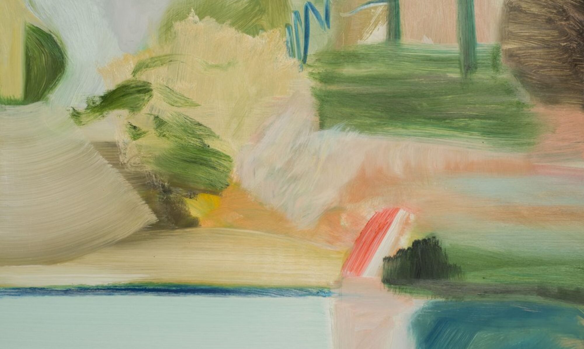


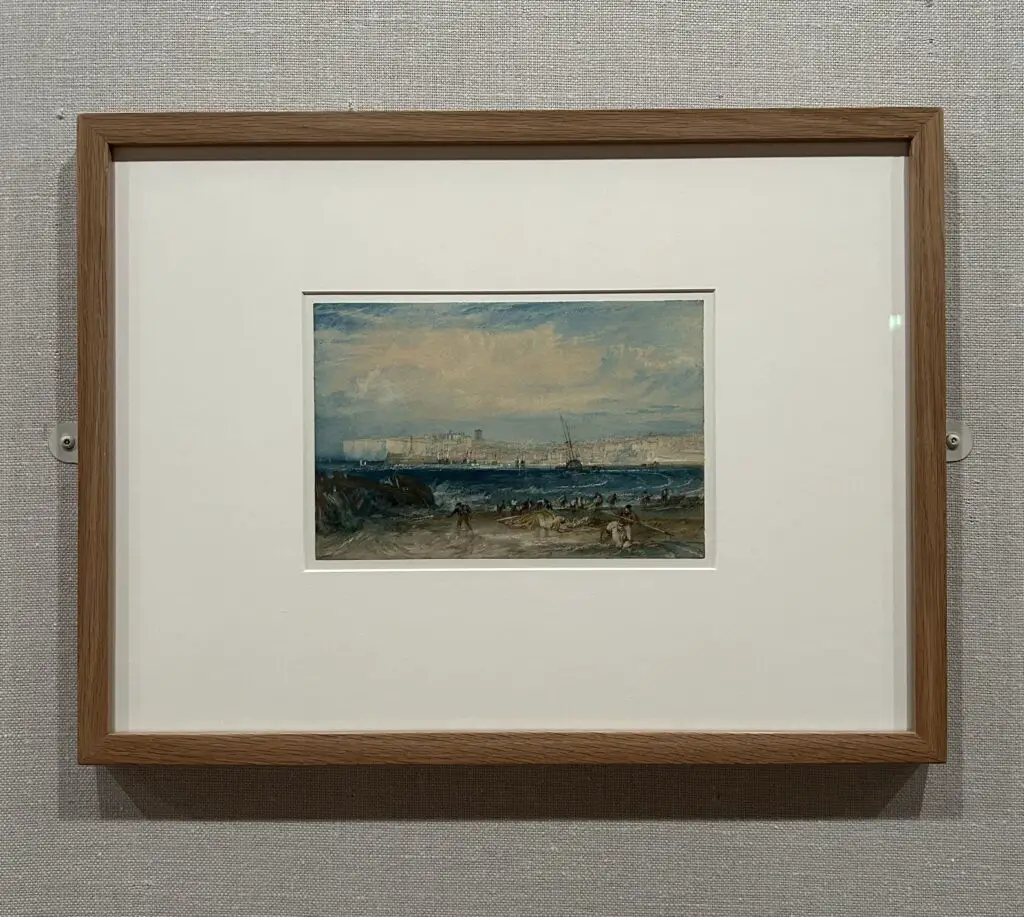


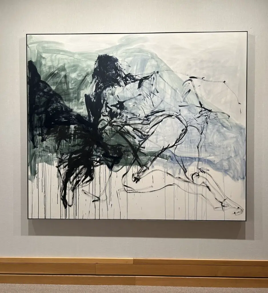


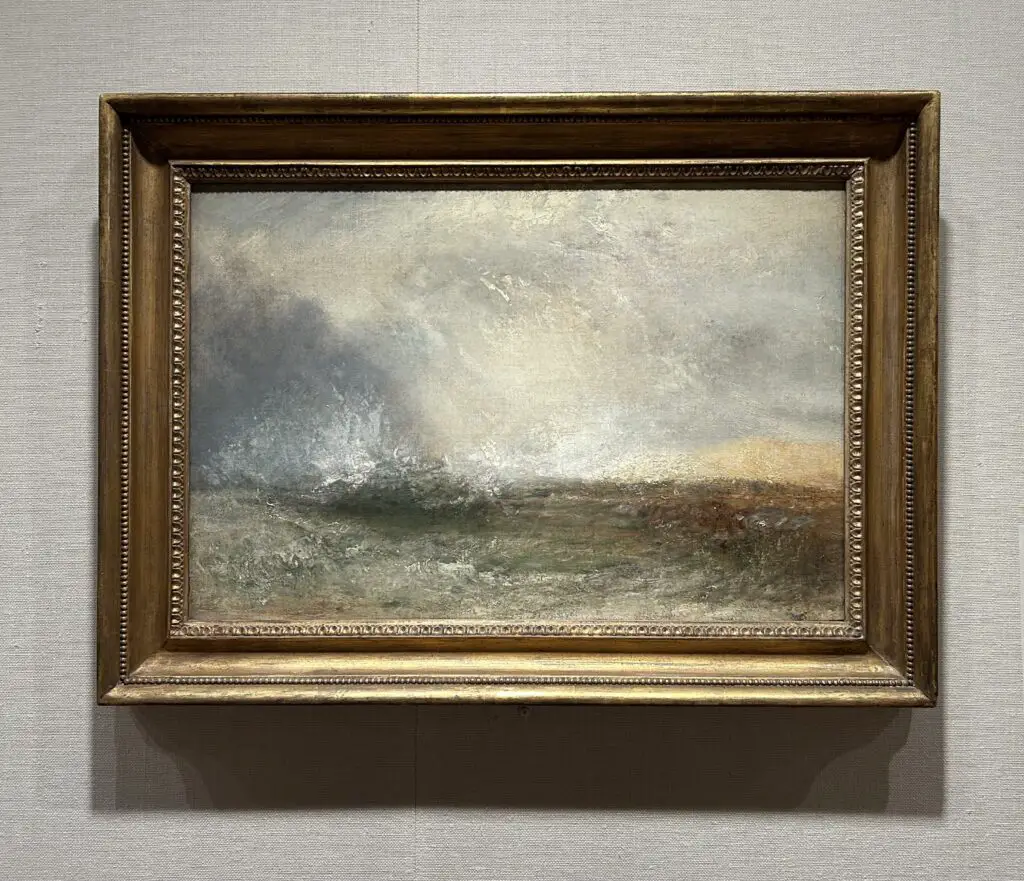


 Support Pendour on Ko-fi