
A NEW APPROACH
What do we think of when we consider the healing power of hospitals?
We may reflect on the care and comfort offered by doctors, the attentive nurses and helpful staff; their understanding and expertise as we place our trust in their hands.

But what about the hospital environment itself? The very walls and windows, corridors and waiting rooms where treatment is administered and the path to recovery and healing begins?
What if the very setting of a hospital could help facilitate the all too often long and challenging journey along that path? What if art and a connection with Nature – aids to contemplation of the miraculous and the invisible – could be instrumental supports along the path to healing?
In Lincoln, Nebraska USA, the April Sampson Cancer Centre recently opened its doors, welcoming patients and their loved ones to an innovative setting, quite unlike any other. All treatment stages from diagnosis to rehabilitation are streamlined and personalised, consolidated under one roof as opposed to fragmented across numerous separate facilities. The Centre’s integration of the Healing Arts and multi-disciplinary approach ensures for enhanced wellbeing and moments of sensitive, spiritual awakening.
The 140,000 square foot facility, which has been named after April Sampson, a local entrepreneur who lost her life to cancer, is built on 28 acres to the south of Lincoln gifted by her family. Offering cutting edge technology and highly advanced treatment options, the Centre also provides patients and their families with support to navigate all that cancer care involves from the meditation and multi-faith chapel to the café, spa and rehabilitation therapy studio.

Led by Doctor Mark Stevas, a Radiologist and Oncology specialist from Lincoln, the project took over six years to come to fruition. A keen guitar player, Dr Stevas has produced several films for Pallidocs demonstrating the importance of the Healing Arts for the personal wellbeing of those who are receiving end of life care in their fight against cancer.
THE SETTING

The Centre’s low-lying, sweeping silhouette follows the typography of the local landscape. Whilst the entrance façade blends in with the gentle rolling hills of the surrounding geography, the inside boasts expansive walls of glass, across two storeys in some places. This maximises the panoramic views of the Nebraskan sky and Great Plains. The site’s pond, meadow glades and forest groves integrate with the inside, providing a deep visual connection with Nature. Geese, ducks, birds and the occasional cow inhabit this seasonally changing picture plane.


Ballinger’s eloquent architecture is reminiscent of Le Corbusier’s. An emphasised overhang not only shades treatment rooms from bright sunlight but offers a sophisticated and contemporary feel. Met with views of the tranquil scenery even from the entrance foyer, a splice of skylights running along a seam in the ceiling draws attention to the grand descending staircase and vistas beyond. ‘There is a crack in everything’ and this symbolic fissure certainly allows the light in.
Designed from the perspective with the patients’ and care providers’ needs in mind, many areas are bathed in natural sunlight whilst the flowing, almost ‘open plan’ feel means that navigating between the designated areas elevates the patient experience.
THE ART OF GENEROSITY

With artworks by over 16 artists spread throughout the Centre, the generosity of local donors and sponsors is evident. Whilst many donated artworks have been acquired on a commission basis and carefully curated, other pieces have been bequeathed by the artists themselves, all serving to create a unique and moving setting. Colour, texture, materiality and visual sublimity coalesce to provide inspiration and positivity for the hospital’s staff and strength, contemplation and hope to patients and their loved ones.
GREAT MINIATURES

The delicate and extraordinarily detailed graphite drawings of Lincoln-based Francisco Souto grace the walls of the waiting room area. His ‘Poetics of Recognition’ respond to the experience of living in the middle of the Great Plains. The vastness of sky and distant horizon are captured and become intimate; the individual trees, grain silos and barns are rendered with enticing detail from restrained observation. Framed within stripes of colourful air-brushed precision, the minute scale of Souto’s ‘Great Plainscapes’ humbly embed themselves within the mind’s eye, furthering the Centre’s connection to the surrounding environment.

CORNFIELDS AND CANVAS

Souto’s ‘Poetics of Recognition’ are accompanied in the entrance area by Omaha artist Thomas Prinz’s ‘Platte River Valley.’ Soothing stripes of yellow and blue are based on photographs of nearby cornfields. Fields of colour and texture are segmented with crisp outlines and dividing passages. The artist has fused photographs of the region’s landscape with the aesthetic appeal of the edges of paintings layered up one on top of another. Sculpturally stacked, the canvas flanks reveal the accidental: the unexpected overspills, barely-there details and drips of the painting process. Digitalised and colour edited, the images have been torn by hand into delicate strips. These ribbons of colour have been collaged and composed in a vertical arrangement in an all-over mode, the original images fragmented and reassembled, made anew in to a hybrid state.
Overlapped and layered, the hidden and the concealed is only glimpsed through the bars of the foreground, what is ‘seen’ and effectively ‘unseen’ recedes and emerges, the bands of lemon yellow interspersed with white and orange against the watery blue.
Reminiscent of SMPTE colour test patterns – once used for adjusting the focus, tuning, shading and curvature of an analogue picture – Tom’s bands of colour perhaps share an affinity with the reassurance of such organised structure, yet seek to reflect the essence and spirit of place. Softening and welcoming, the work provides a therapeutic quality, almost meditative in aura.
WRINKLED MIRROR

Upon reaching the twist of the great descending staircase on route to the rehabilitation area, one is not only met with the impressive views of the Midwestern landscape, but a horizontal band of crumpled, shining silver, split into two separate panels almost floating across the entire span of the wall.

Although at first glance this may appear to be a fragment of an Apollo spacecraft, it is in fact a ‘Wrinkled Mirror,’ the sleek, incidental work of Christopher Prinz. A graduate of Rhode Island School of Design, Chris’ oeuvre ranges from furniture to chandeliers and can be found in major fashion house showrooms, his luxury-meets-semi-industrial-style favoured by the likes of Louis Vuitton.
A spider’s web of criss-crossing fold lines force the sheet of aluminium away from the 2D flatness of a traditional wall piece and into the 3D realms of the sculptural and the physical. Lunar-like, the piece has an otherworldly, dreamscape presence. The wrinkles formed from the smoothness of the metal are akin to crinkles in newly washed sheets or the creases of unmade bed linens. The silvery shade of raw, untreated aluminium takes on a moon like quality, heightening an aesthetic similarity to DuPont’s Kapton Foil.
Celebrated for its thermal protection qualities, Kapton Foil has been an essential ingredient for space exploration since the Apollo 11 Missions. Utilised in the thermal shielding of astronauts’ space suits, the durability of Kapton Foil has been integral to survival in the harsh conditions of outer Space. With an ability to withstand temperatures from -269°C (-452°F) to 400°C (752°F), the aluminumized polyimide has enabled exploration into unchartered territories. ‘Wrinkled Mirror’ also encourages patients to consider their own personal journey into the unknown and the uncertain from a new perspective; an exploration into their own vast sense of being so as to find a way to sustain the difficulties of a diagnosis.
We fight the irresistible urge to touch Chris’ handiwork. To push out all of the folds and smooth them flat, as though the artwork were a larger-than-life piece of tinfoil, characterised with ghostly traces of former crumpling, just as a Medieval fresco is veined by scattered surface cracks.
In the same way that crinkly space blankets are used to retain heat in athlete’s bodies we perhaps re-imagine the work as a sort of protective blanket; it seems desirable to wrap up, shelter and comfort all who pass through the Centre for treatment in a blanket formed from a flattened, as-yet-uncreated version of ‘Wrinkled Mirror.’

Not only protecting Space explorers from the extremes of heat, Kapton Foil maximises radiation reflection, meaning Chris’ artwork holds a specific poignancy as a work of art commissioned for and installed within an oncology setting.
The silver front and gold backing of Kapton Foil coating Space capsules usually disintegrates upon re-entry to the Earth’s orbit. Small fragments are collected by recovery crew as mementos, souvenirs as reminders of human ingenuity and bravery. ‘Wrinkled Mirror’ perhaps shares an affinity with these particles of Kapton Foil and the desire to cling on to what has saved and protected life out in the unknown.
Chris’ piece takes the form of a diptych and the wrinkled folds have been painstakingly mirrored across the divide. A single wrinkle can be followed from the left panel on to the right side as though a panoramic landscape. Endless reflections bounce off from this multi-faceted surface. From the water ripples skimming the pewter toned lake opposite through the window to the red glow of the Exit signs above, Chris’ Mirror provides a unique reflection of the April Sampson Centre’s interior and surroundings.

Whilst the piece reflects and generates a fragmented version of the views outside, the piece can be considered a landscape itself. The bent and creased sections form valleys and troughs, mountain peaks and cirques, in which the mind can hike and wander, as if in a mountain range or maze. A connection, perhaps, to the artist’s own enjoyment of the outdoors and sense of adventure.

As we study these gorges and crevasses our own reflections are also captured in this lunar-esque landscape. A little like a Francis Bacon portrait, we look on as our own faces and bodies appear repeated and contoured. The crinkles and creases of ‘Wrinkled Mirror,’ may even be related to the complex, symbolic patterns of unearthed Bronze Age burial or ritual mirrors, such as the Desborough and Portesham Mirrors (c. 50BCE, 1ADE). Prized for their reflective qualities at a time when only water revealed a glimpse of what one looked like, it is thought such hand-held mirrors enabled communication with the deceased and offered connection between the physical and spiritual worlds.
Chris’ contemporary ‘Wrinkled Mirror’ therefore provides an opportunity to look beyond the Self to Space exploration, human ingenuity and spiritual rituals of the past. The infinite reflections offered by this Mirror invite viewers to look afresh at a certain situation – to see what is beyond the wrinkled crumples on the surface – and find deeper meaning with a new perspective.

Earthline

The majestic red and gold glow of Steve Joy’s ‘Earthline’ has a magnetic presence. Installed along the main corridor stretching between treatment zones, the opulent and powerful palette attracts our gaze. Cloaked in gold and silver leaf veiled behind layers of shellac varnish, the physicality of the artwork enables viewers to enter an ethereal place.
Reaching backwards through the centuries, to the time of Byzantine principles of image making, ‘Earthline’ takes its lead from the sacred function of Medieval Icon painting and the pre-invention of perspective prior to the Renaissance.
‘Earthline’ offers a contemporary interpretation on the sacred art form of early Icon paintings. Marrying traditional, sustainable materials such as wood, gold leaf, beeswax, inks and shellac varnishes with visual concepts of the contemporary age, Steve’s painting is a feast for the eyes and a tonic for the heart. Repeated colours and gloss-like textures provide moments for the eye to linger and get lost in.
We may think of stories such as the Icon of Panagia Hozoviotissa. Invasions in the Middle East in the eighth century meant that this precious Icon had to be saved by being placed in an unmanned boat and floated out into the Mediterranean Sea. The Icon eventually made landfall on the Greek Island of Amorgos, where a Monastery, dating from the eleventh century, has been carved into a cave on a precarious cliff face – a poignant tribute to the Icon’s landfall. Steve’s ‘Earthline’ recalls the divine mystery of such events.

The artist masterfully fuses Religious Eastern European visual culture with the full force of ambitious American Abstraction. The ‘human’ scale of a traditional Icon painting has evolved and developed into the proportions of an entire church nave whilst the Byzantine resemblance of saints has been purified through abstraction into blocks of colour and texture. The individual identities of saints are transposed into universally aesthetic bands of gold and mineral-based paint. Squares and stripes of earthy, terrain-hued browns bleed into the reds of roses and papal garments to accompany the golden light of the eastern Byzantine sunrise.
Falling almost like a curtain, a drape with an architectural nature, the painting offers a diffused, comforting glow, like a candle on a banquet table. Even at night time the painting gives out light. Through contemplative looking and thoughtful engagement, spiritual transformation is offered alongside an immense feeling of timelessness between past and present and East and (Mid)West.

Based between Omaha, Long Island and Plymouth UK, Steve Joy has exhibited his mesmerising paintings in notable museums and galleries throughout Europe and the USA. Worldwide travels to exotic, far-flung locations serving in the Royal Air Force and in search for inspiration influence the concept of many of Steve’s pieces.
Whilst the vertical pattern of ‘Earthline’ evokes the longitudinal lines of an Atlas, the modular composition of separate wooden panels is suggestive of an expanding horizon line, the span betwixt each module existing as though a gravitational force holding each section in place. The relationship between the ‘present’ and ‘absent’ areas of the painting become the solid columns and soaring archways of Gothic Cathedrals, inviting our consciousness to pass across a symbolic transept and to explore a new experience.
Strength and modernity are found in this vertical pattern. Whilst the tall red and gold stripes emerge like skyscrapers rising above a city skyline, the traditional boxy, red-brick architecture of the American Midwest is perhaps signified by the smaller segmented squares of honey, silver and flashes of cornfield green.

The ‘dropped’ section of stripes not only augment the uniformity of the painting’s base line but mean the work exceeds the usual boundaries of a rectangular painting. Behaving as a lower mordent in a musical phrase, this sudden yet necessary feature heightens the sculptural tonality of the piece, disrupting the painting’s horizon line.
Like a ‘call and response’ – a question called into the void answered after a slight pause with the clarity of ‘gold, red? – taupe – gold – red – gold,’ the work forms a secret code of communication. But how should we decipher such a code?
Viewed in its entirety across the corridor, ‘Earthline’ shares an affinity with the visualisation of DNA genetic code. Recalling the stripey pattern of a karyogram where G- and R- banding techniques enable specific genes on a chromosome to be mapped and located, the pull between dark and light, earth and gold, presence and absence, form the base pairs of this work’s phenotype. Only this painted form of cytogenic mapping enables viewers to consider the miracle of DNA and our very existence in an emotional and universal way.
Just how a mutation along a the stripe of a particular gene sparks the process of biological evolution, Steve’s signature style of working is a unique specimen in the trajectory of painting; ‘Earthline’ therefore becomes a fitting work of art for a Healing and Recovery Centre.
ART ALCOVES


Dotted further along the central axis corridor are several ‘art alcoves’ where framed pieces by Tom Prinz and Mike Nesbit are displayed. Comfortable seating and living plants mean that these alcoves become quiet reflective spaces for introspection and contemplation, cocooned from the passing footfall of the Centre’s central hallway.
WEST MEETS MID-WEST

Based between Omaha and LA, Mike Nesbit is a co-founder of Maple Street Construct and pieces from his colourful series ‘Highland at Noon’ punctuate the walls of these restful alcove spaces with welcome pops of pure colour.
Echoing the energetic brushstrokes of action painting, bursts of sunshine yellow merge into hazes of cobalt blue as drifts of pink mingle with refreshing tones of turquoise as if engaged in a choreographed dance. Only unmixed, primary colours of each shade have been used based on the contrasting subtraction and addition properties of CYMK (Cyan, Yellow, Magenta, Black) and RYB (Red, Yellow, Blue) colour systems.

Infused with touches of silver leaf, echoing the sheen of Chris’ ‘Wrinkled Mirror,’ the clouds of colour are interlaced with lattices of grid references. These stretch the length and breadth of the pieces and criss-cross the conceptual colour palette of the screen-printing process. Whilst these lines may appear to find their traces in the artist’s background as a qualified architect, they are in fact based on satellite images of LA and Omaha.

In contrast to the cosmopolitan cityscape of LA, Omaha’s suburban identity in the centre of the United States features cornfields and greenery. Whilst the title of the series refers to Highland Park in LA, the time of 12 noon adds a narrative element of high sun, shadow lines and even human activity. The formal lines and shapes generated by the satellite images physically represent the similarities and differences of these two cities in the context of the twenty first century.
In the setting of the April Sampson Cancer Centre, the idea of place and time becomes both transcendental and pragmatic. Mike’s series of colourful works not only brighten and lift the mood of the Centre, but act as gateways and bridges from one time and place to the specific time, place and ambience of another.

GIOTTO BLUE
Upon exit of the main treatment area, patients of the April Sampson Cancer Center face one of the ‘art alcoves’, the B Alcove for Blue. Giotto Blue.
Imbued with a chapel-like quality, Tom Prinz, Steve Joy and Mike Nesbit collaborated on the theme and final impression of this secluded space. The artwork in this alcove is inspired by Giotto di Bondonne’s (1267 – 1337) frescoes in the Arena Chapel in Padua, Italy. The colour blue and its psychological healing properties has influenced the three artists’ holistic approach.

Built on a former Roman Amphitheatre, the ‘Giotto Chapel’ was commissioned by the Scrovegni family as an annex to their palace (destroyed 1827) for absolution from the sin of usury and still stands today. The brilliant blue interior was completed by Giotto and his assistants between 1303 and 1305. Depicting a cycle of 36 scenes from the life and passion of Christ and the virgin Mary, each spellbinding fresco is bordered by impressive imitation mosaic trompe-l’oeil. Completely covering the walls and extending up to the ceiling – a starry firmament of royal blue – the chapel is a testament to Giotto’s revolutionary painting style.
Floating angels join the mother of Christ and prophets hover in circular rondos to watch over the sophisticated chronicles of Giotto’s invention. High above in the lofty realms of the chapel’s barrel-vaulted ceiling, their haloes glint against the rich sky of ultramarine blue.
Giotto’s illusionistic storytelling style displays previously unknown theatrical tension and skilful depiction of the infinite emotions expressed by Man. The chapel demonstrates how a celestial vision can be implanted into the earthly planes of the everyday. Leading on from this, the artworks of the B Alcove transport patients to an alternative time and place, outside of the hospital setting. An alternative time and place of abundant sustenance, empowerment and wisdom. A place outside the challenges of the present moment.
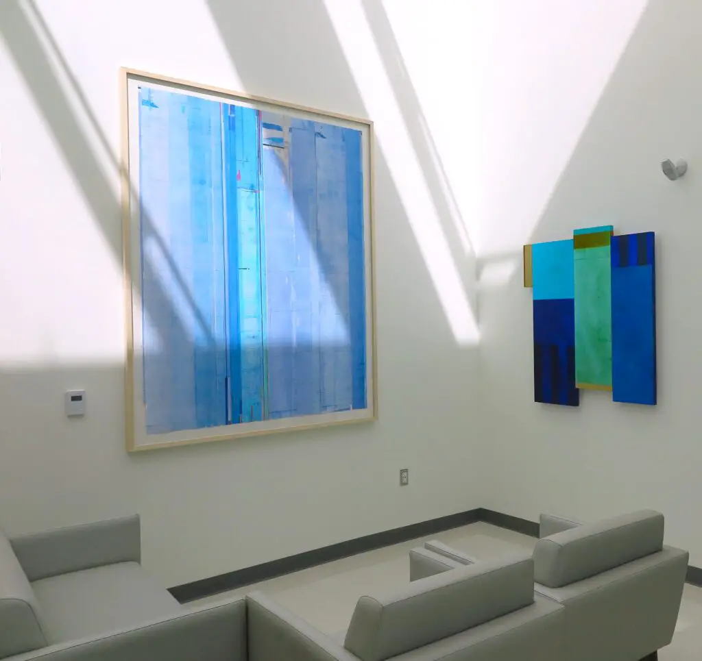
Perhaps most closely aligned to the idea of the chapel’s overall structure and feel is Tom Prinz’s ‘Giotto’ inscribed print. Delicate shades of blue waft like uncatchable air, reminiscent in tones of fresh tempera soaking into wet plaster. Yet this work of art is ink printed onto paper, a contemporary use of technology and materials. An extension to Giotto’s own ground breaking introduction of perspective and intricate details.
Tom’s incidental lines, vertical stripes and touches of yellow reflect how Giotto’s frescoes are full of subtle nuance and astounding detail. For example, even the delicate faces of women half-hidden behind wispy, see-through veils are masterfully rendered in Giotto’s creation. Within the blue haze of Tom’s artwork you can just spot the name ‘Giotto’ written in a fine script as a homage to the Medieval painter’s vision.
Tom picks up the thread – literally – of the materials rendered by Giotto: the robes replete with detailed cuffs and hems worn by the faithful; the soft-looking blankets covering seats and beds and even the fine threads spun by a young woman in the Annunciation Scene are all echoed in Tom’s use of physical white fibre. Tom’s subtle threads gracefully add to the collaged texture of the piece in the form of running-stitches. The painting sphere of the illusioned and the imagined is physically pierced by the needle of the sewing machine, the artist’s framed artwork an extension to the impression of clothing and furnishings rendered in figurative painting.

Meanwhile, a faint grid appears to offer an underlying structure. This has been achieved by superimposing a photographic image of an open spread of rectangular postal envelopes. The motif of the envelope conjures ideas of correspondence and communication. Echoing the borders surrounding each of Giotto’s 36 scenes, the edges of the envelopes enable the very structure of Tom’s piece to link back to the layout and compositional construction of Giotto’s masterpiece.
Giotto’s figures seem contained and compartmentalised within their allotted spaces acting out scenes of life, death, forgiveness and helplessness. However, in Tom’s case, the borders become paper-thin and barely-there, as though the characters of Giotto’s brush have been set free to allow for more spiritual emphasis on the colour blue.
Stretching downwards through the centre of Tom’s artwork is a band of a lighter blue, a Bluebeam behaving like a shaft of light silently sailing in through a clerestory window. Such windows are usually located high up within a church setting, towards the eaves to provide overhead ambient lighting without distraction of, or interference from, the view outside. Shining in from the top of the artwork, the eye is drawn upwards as if one has suddenly been transported to the Arena Chapel itself, towards the magnificence of the star-studded grandeur of an oceanic sky of lapis lazuli.

Once more valuable than gold, lapis lazuli was sourced in what is now Afghanistan to produce the powder for blue paint and could only be applied sparingly on artworks, except for the wealthiest of patrons – as was the case with the Scrovegni family! The blue of Steve Joy’s ‘Invocation for Blue (Giotto)’ recognises this historical fact.
Steve’s delicate shades of blue heighten, deepen and shimmer like a transparent, glassy topaz. Highlighted in synchronisation with the trajectory of the Nebraskan sun, his shades of blue provide a calm, zen like allure reflective of the sublime essence of the Midwestern sky itself, assisting to put patients and staff at ease.
Shaped a little like a Medieval altarpiece we can almost imagine Steve’s contemporary Icon-style painting installed within the Arena Chapel itself. Three vertical sections not only parallel the two side walls and central west wall, where Giotto’s ‘Last Judgement’ fresco takes centre stage, but the sacred geometry of The Three In One.

However, just as in Tom’s painting, there are no visualisations of suffering or the consequence of sin. These illusions are abandoned to favour the flatness of the picture plane and the materiality of the blue-bathed silver leaf. Whilst the darker stripes recall the columns of narrative scenes in the Arena Chapel, Steve’s blue glow perhaps reflects the blue light of our computers, tablets and digital devices. Steve himself has even suggested that the trifold arrangement of an ‘Invocation for Blue (Giotto)’ recalls the outline of TARS, the monolith like robot in Christopher Nolan’s film Interstellar (2014).
The little rectangle of gold attached to the upper right of the piece appears not as an appendage tacked on to a being of Artificial Intelligence, but as a direct connection to the golden haloes of Giotto’s fleeting, floating and playful angels. However, perhaps in this case, Steve’s artwork is not the domain of soft winged Gabriels and handsome Michaels – the angels of Medieval imagining – but the realm of the ‘terrible’ Angels of the contemporary age as portrayed by Rainer Maria Rilke (1875 – 1926) in the Duino Elegies. As such, Steve’s piece strikes a chord with the idea of needing something that ‘enraptures, consoles and helps us’ through life. Not to explain or to justify the world, but to bring us closer to it through poetic metaphor. As suggested by Rilke, humankind – like angles – are only visitors in this world.
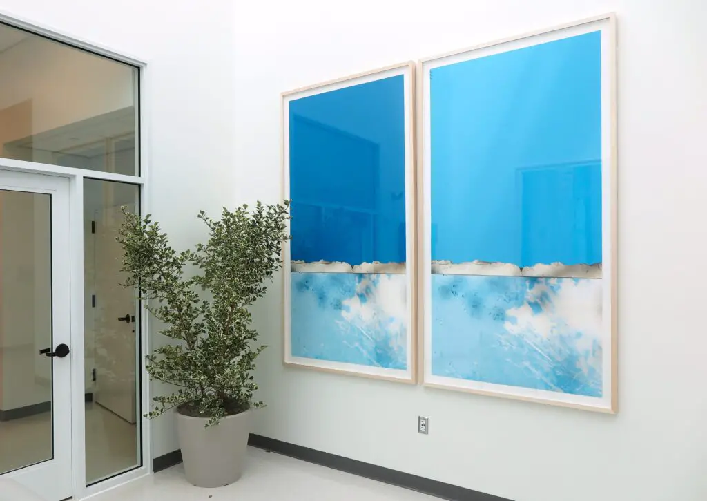
Reflecting the subtle graduations of blue in Giotto’s frescoes, from the skirting up to the curving apex of the ceiling, Mike Nesbitt’s Giotto diptych takes it cue from an earlier piece the artist made in response to the expansive skies of Nebraska.
The two parts of Mike’s diptych are based on photographic close-ups of the ‘McCook Blues,’ a piece the artist previously installed in Norris Alley, McCook, in the west of Nebraska. This large-scale work of pre-cast concrete is coated in layers of custom blue and white coloured concrete. The marbling colours and raw textures of the work reflect the artist’s recollection of the Nebraskan landscape coated in white snow, stretching out to the horizon where the sublime blue sky gathers.

Placed in the alley’s central spot, the ‘McCook Blues’ merges sky with landscape and vice versa. The recently re-invigorated alleyway is named in memory of Senator George W. Norris, a great supporter of innovative technologies. Mike’s piece is a fitting tribute to the senator’s thoughts about “what hope a simple cloud along the horizon could stir,” for Midwestern communities. Much of Mike’s practice is about bringing communities together and striving to bridge gaps between the industrial, the disused and the rural through a soulful search of cultural placemaking.
The diptych in the B Alcove of the April Sampson Cancer Centre shows a section of the edge of the ‘McCook Blues’ with the Nebraskan sky above. A double entendre then, as the concrete itself has been inspired by the palette of the sky under which it sits. This duality is further heightened by the similarities the ‘McCook Blues’ shares with both contemporary billboards and the Standing Stones and stelae made by our ancient ancestors.

We see from this close-up image that the edge of ‘McCook Blues’ is thick with crusted, coagulated concrete, like a thick shell of white lava, seemingly kissing the fabric of the sky. Mike has taken one pixel from the various shades of blue and edited the diptych so that the entire expanse of the sky in each piece is a singular and specific shade of blue. A single moment of sky, an ecstasy of blue, captured, enlarged and repeated.
Calling to mind the visual impact of ‘International Klein Blue’, a shade invented by the French artist Yves Klein (1928-1962), Mike’s creative process finds a more subtle connection to Gustav Mahler’s thoughts about his Fourth symphony.
The tender delicacy and airy lightness of Mahler’s Fourth was inspired by Das Himmlische Leben or ‘Life in Heaven,’ a song the composer wrote based on a collection of German folk poetry. Mahler described the basic tone of the symphony as the ‘undifferentiated blue of the sky’ and claimed he had much trouble in capturing this compared to the sky’s changing and contrasting shades.
Soaring above the solidity of the concrete, is Mike’s undifferentiated shade of blue a representation of Heaven then?
The desire for a singular shade of blue to sweep across the sky perhaps reflects how we wish to control a certain situation. As suggested by Rilke in the Duino Elegies, we can change the world by changing our sense of it.
Rilke composed the Elegies in the north of Italy overlooking the soft blue waves of the Adriatic Sea and the controlled blue hues of the B Alcove draw us in towards a celestial world, a heavenly mirage. Just as angels festoon the walls of the Chapel in Padua – their haloes still shining brightly against the mists of time and the dust of lapis lazuli – the artworks of Tom, Steve and Mike not only transport viewers to a time and place of another, but imbed a transient, ethereal moment into the very existence of the present. The invisible becomes spiritually visible, offering a new order of reality.

Like Mahler’s Fourth Symphony and Rilke’s elegies, the blue artworks of the B Alcove are evidence that we are not marooned in the contemporary world of the everyday or the difficulties associated with a cancer diagnosis, but surrounded by the miraculous, especially during the transformative process of healing.
PENDOUR PICKS
Solo Exhibition at the Russell Gallery, Putney, London
PENDOUR CULTURE
Linda Bell
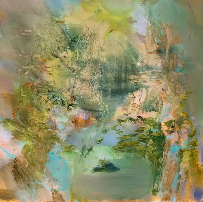
Solo exhibition at the Russell Gallery, Putney, London
PENDOUR CULTURE
Linda Bell
THE ALLURE OF PENDOUR



Great content! Super high-quality! Keep it up!
Thank you so much, hope you continue to enjoy all things Pendour!
You can definitely see your skills in the work you write. The world hopes for even more passionate writers like you who aren’t afraid to say how they believe. Always follow your heart.
Pretty great post. I just stumbled upon your weblog and wished to say that I’ve truly loved browsing your weblog posts. In any case I will be subscribing on your rss feed and I am hoping you write once more very soon!
Hi there, that’s wonderful to hear! Thank you so much.